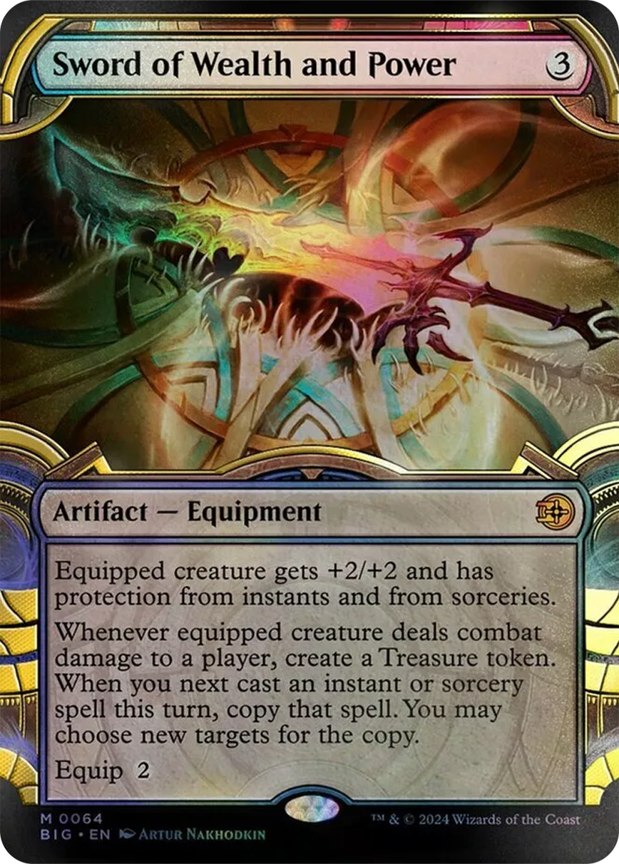
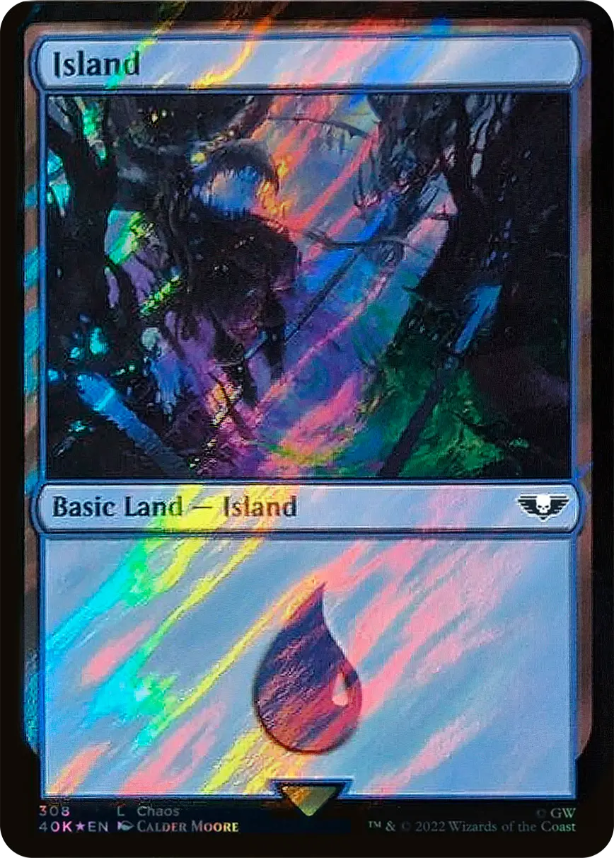
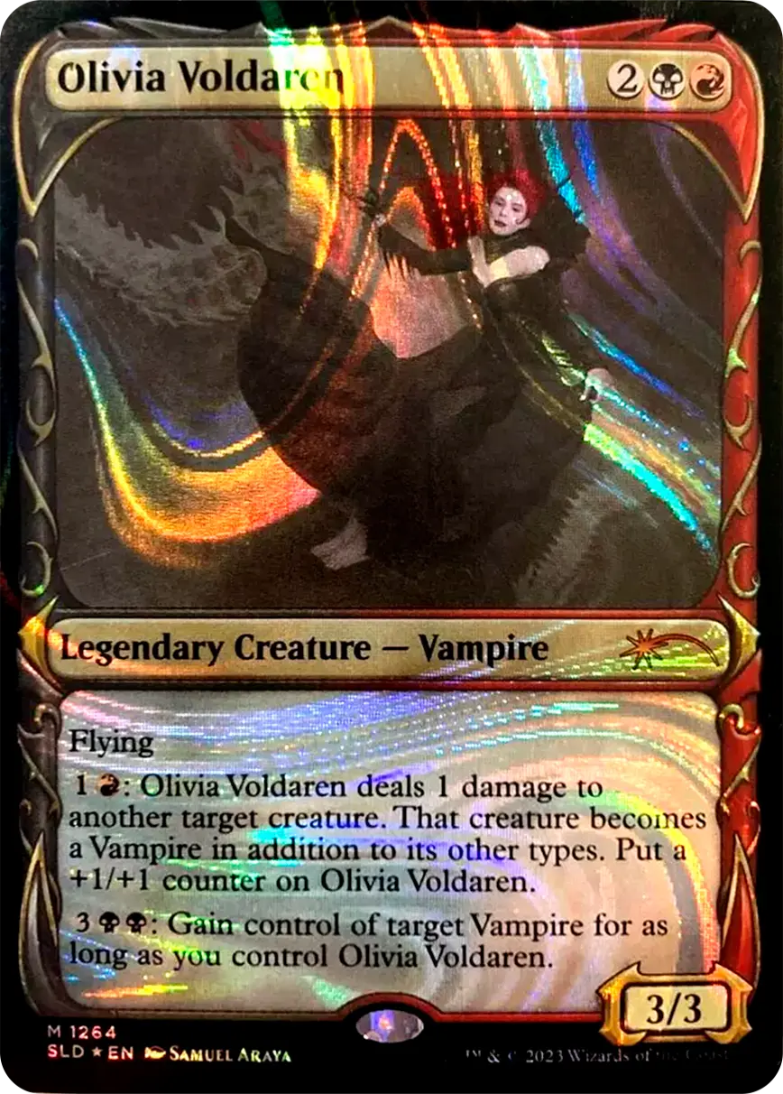
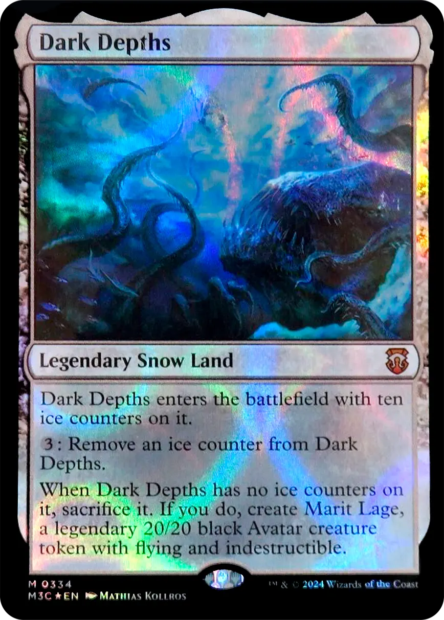
How to Recognize a Card

To manage useful information and updates on newly released cards, we recommend visiting the page to stay informed about any exceptional or specific cases that could lead to mistakes when selling or choosing which card to purchase.

In this guide, we will start by explaining how to recognize the cards you own from all the games covered on Cardtrader.
Select the game you wish to explore from the tab.

Recognizing Western and Japanese Sets

You need to pay special attention to first editions of cards to avoid confusion. Pokémon cards differ between those printed for the Eastern market and those for the global Western market. The differences go beyond just the language on the card.
In the '90s, it was easy to tell which set Japanese and English cards came from, as the set names were the same. However, in modern sets, this is no longer the case.

Japanese sets for the Pokémon TCG tend to be smaller subsets of the English versions. Usually, the Japanese set consists of two smaller sets compared to the English one, though there may be exceptions.

For example, the English set "Astral Radiance" is split into multiple sets in Japanese:
Battle Region (s9a)
Time Gazer (s10D)
Space Juggler (s10P)

ASTRAL RADIANCE TG08/TG30

ASTRAL RADIANCE 114/189

ASTRAL RADIANCE 040/189

To recognize which set a card belongs to, just look at the top left corner. Western language sets usually have a specific symbol or letter code for each expansion, while Japanese sets are marked with a code of letters and numbers.

BATTLE REGION 071/067

TIME GAZER 049/067

SPACE JUGGLER 023/067

Differences Between Eastern and Japanese Cards

apanese and English cards have aesthetic differences related to the card edition, Reverse Holo treatment, and printing year. They don’t always keep the same features in their corresponding sets, with different design updates.

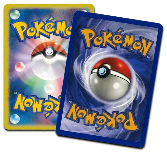
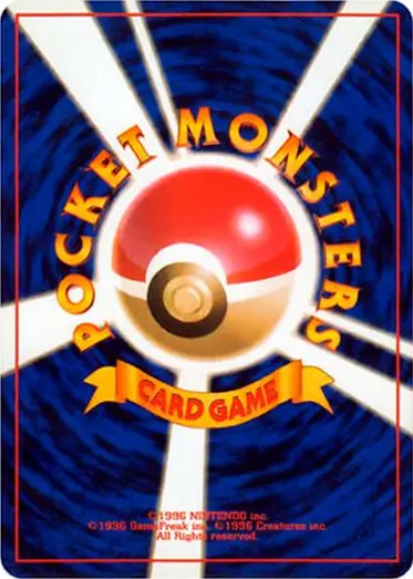
The back of Pokémon cards stays the same but can be easily distinguished:
► English cards (European languages, Chinese, and Korean) have always had the same back.
► Japanese cards have a completely different back (updated only once in 2001).

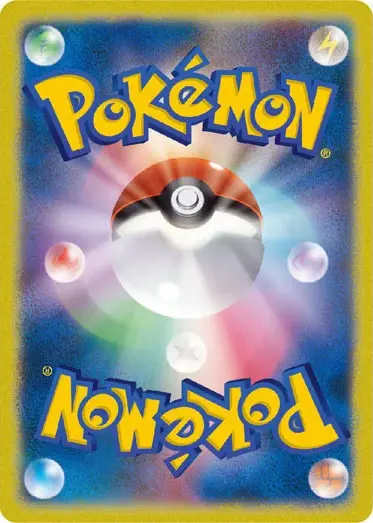
CARTA OCCIDENTALE / CINESE / COREANA

CARTA GIAPPONESE (dal 2001)

CARTA GIAPPONESE (1996-2001)

With the release of Pokémon "Black & White" in December 2010, some Japanese holographic Pokémon cards changed from yellow borders to new silver/gray borders, while the first silver-bordered cards in the West arrived only with "Scarlet & Violet" in December 2022.

As shown in the example, Japanese cards keep the same values, images, and layout, but they differ from the English edition in terms of Reverse Holo type, borders, expansion code, rarity, and serial number.

Difference Between Non-Holo, Holo, and Reverse Holo Cards

In contrast to a regular Holo card (where the effect is applied to the image), a Reverse Holo usually has the effect applied to the entire card, except for the image of the Pokémon.

There is usually a Reverse Holo version for each card in a set that does not have the illustration extending across the entire card (e.g., Ultra Rare, Secret Rare, Illustration Rare...).

On our platform, the diamond icon 💎 indicates that the card being sold is "REVERSE HOLO."

You should always consider the possibility that the card you have in front of you might have different versions. There are cards printed in promotional editions, theme decks, blister exclusives, which might come with a different Holo (usually Cosmos Holo for promo cards) or might not be holo at all (many cards are reprinted non-holo in pre-constructed and themed decks) compared to the main set printing.

Additionally, be sure to pay close attention to Reverse Holo cards from certain editions, which might not follow the standard rule where "Reverse Holo = hologram outside of the Pokémon's image."Check the following sections to identify each type of Holo and Reverse Holo.

For the disambiguation of similar prints, the platform will indicate (in parentheses next to the card name) the version that distinguishes it from other cards that might be confused with it (e.g., Cosmos Holo, Non-Holo, Cracked-Ice Holo…).

Please note that digital images may not accurately represent holographic effects or textures on physical cards. It is advised to refer to official descriptions and specifications for the actual appearance of the card. Our platform is committed to providing accurate representations of cards through official digital images or real-life photos, and clarifying similar cases with the specified version.

Holo versions (Cracked Ice, Cosmos, Sheen)

Over the years, there have been several experiments and changes in how holo cards are presented, depending on the expansion, Japanese or Western cards, and promotional editions.
We ask you to be careful with cards that might look very similar at first glance: there are reprints of cards that, even though they have the same serial number or design, may have a different "holo" effect.

It is necessary to rely on the version specified next to the name to avoid confusing the different holo prints of the same card. For example, some cards reprinted in theme decks have a different holography compared to the card from the main set.
As shown in the images below, you should be careful to understand the holo difference by tilting the card under good lighting and always checking for other prints with the same image, serial number, expansion code, and layout, but with a different holo effect (so the card should be listed in the correct listing).

The type of Holo can vary depending on the rarity and edition. To make sure you don’t create the wrong listing, we always recommend checking the edition variants of each card using the "view all versions" button found on the listing page just below the card image.

Reverse Holo versions (Logo stamp, Energy, Master ball...)

Reverse holo cards are one of the most loved variants by Pokémon collectors, but their presence and design can often mislead those who aren’t experts. In many expansions, the reverse holo version doesn’t always follow the classic pattern (where the holographic effect is applied only to the background, leaving the central image intact), but instead has a design similar to the regular Holo version.

A notable example of this variation can be found in the EX Series (2005-2007), where reverse holo cards feature only a “logo stamp” on the image, instead of the traditional foil on the background. This graphic treatment makes the card easily confused with the regular version, leading to reverse holo cards being incorrectly listed.

Understanding these differences is crucial to avoid confusion and properly identify valuable or rare cards that might, at first glance, seem like regular cards. The following "Reverse" cards should always be listed for sale with the correct "💎" Reverse attribute (it must appear next to the listing).

EX Series FireRed & LeafGreen 2004

The "Reverse Holo" design for FireRed & LeafGreen features a Holofoil Energy pattern in the Pokémon image. Only cards with "Holo Rare" rarity will also have a large Pokéball symbol in the move box, decorated with the same "Holofoil Energy" pattern when they are Reverse Holo.

Ancient Mew prints

Some cards may seem the same. If you know how to observe certain details closely, you'll be able to recognize and correctly distinguish the print edition. Recognizing the difference in the type of pattern allows you to better identify your cards and list them for sale correctly.

For example, the easiest way to tell the difference between all "Ancient Mew" cards is through a combination of both the copyright date and the holographic pattern (this card was printed with two different holographic patterns: "dots" and "cosmic" – known in English as "speckle" and "cosmos").

"Nintedo" Error
JP

The first "Ancient Mew" released was "Ancient Mew I." Unfortunately, the copyright date had a printing error, where "Nintendo" was written as "Nintedo." This mistake was not corrected immediately, and the reprinted, corrected version is actually much rarer than the first misprint version.

►Speckle holofoil pattern (dots texture)
Copyright date: ©1995, 1996, 1998 Nintedo/Creatures inc./GAMEFREAK inc.

"Nintendo" Corretto
JP

Corrected version of Ancient Mew I, which correctly shows the name "Nintendo." Both the error version and the corrected version share the same speckle holofoil treatment, so they can only be differentiated by the copyright information.

►Speckle holofoil pattern (dots texture)
Copyright date: ©1995, 1996, 1998 Nintendo/Creatures inc./GAMEFREAK inc.

Ancient Mew II
JP

The big difference between "Ancient Mew I" and "Ancient Mew II" is the holofoil pattern. This transition from the speckle pattern to the cosmic holofoil pattern is the only way to distinguish between a corrected version of Ancient Mew I and Ancient Mew II.

►Cosmos holofoil pattern (galaxy texture)
Copyright date: ©1995, 1996, 1998, Nintendo/Creatures inc./GAMEFREAK inc.

Ancient Mew - International Print
EN

The "International Ancient Mew" refers to the first release of Ancient Mew outside of Japan. All versions of the international release are the same, with no differences in print or holo. This means the Italian, German, or French versions look the same as the USA version, which looks the same as every other "Ancient Mew" released internationally.

►Cosmos holofoil pattern (galaxy texture)
Copyright date: ©1995, 96, 98, 99 Nintendo, Creatures, GAMEFREAK. © 1999-2000 Wizards.

Japanese 2019 Reprint
JP

In 2019, the "Ancient Mew" was reprinted to resemble the original "Ancient Mew I," and visually, it achieved this goal. The cards are identical except for the copyright date.

►Speckle holofoil pattern (dots texture)
Copyright date: ©2019 Pokémon/Nintendo/Creatures/GAME FREAK.

Korean 2020 Reprint
KR

In 2020, "Ancient Mew" was reprinted in South Korea as well, featuring the Speckle Holo treatment like the fourth Japanese print, but with a copyright date of 2020 instead of 2019.

►Speckle holofoil pattern (dots texture)
Copyright date: ©2020 Pokémon/Nintendo/Creatures/GAME FREAK.

Shadowless

"Shadowless" refers to a series of graphic differences that only appeared in the English language printings of the Base Set.

The most notable "shadow" difference is in the border surrounding the Pokémon's image. In the Shadowless version, this border is flat and lacks a shadow or depth, making it appear as if the border is stuck to the background. Starting from the third English printing (Unlimited), this design was modified to create a more 3D and raised effect for the border, distinguishing the later prints from the earlier Shadowless ones.

On our platform, you will find two distinct editions of cards: Base Set and Base Set Shadowless.

Base Set Shadowless: This includes the first two exclusive English printings, characterized by the absence of the shadow effect on the Pokémon's border. This version is known for the original design without the shadow.

Base Set: This includes English Unlimited cards (without the "1st Edition" mark and with a shaded border), along with 1st Edition or Unlimited cards in other languages such as Italian, French, German, Spanish, and Dutch, all with the shaded border.This distinction will help you correctly identify the cards based on their edition.

SHADOWLESS
1st Edition

First exclusive printing of the English Base Set. English cards with the "1st Edition" symbol are only available in the shadowless version, as the shadow was added starting from the third print run (Unlimited), except for "Machamp 8/102."

▶ 1st Edition Symbol
▶ No shadow on the border of the image frame
▶ Has red "HP" text and slightly different move text compared to the Unlimited edition

SHADOWLESS

Second English printing without the "1st Edition" symbol, but still maintaining the "shadowless" design.

► No shadow on the border of the image frame
► Has red "HP" text and slightly different move text compared to the Unlimited editions

UNLIMITED
©1999

Third English printing, without rarity symbol and with a gray shadow on the image frame.

This variant is the most common among Unlimited cards, with the copyright: "Wizards 1999".

► Shadow on the image frame
► Copyright "1995, 96, 98 Nintendo, Creatures, GAMEFREAK / Wizards 1999"

UNLIMITED
©1999-2000

Late English printing, sourced from a UK factory. It differs only by the copyright date from the common Unlimited printing.

This variant is rare among Unlimited cards, with the copyright: "Wizards 2000".

► Shadow on the image frame
► Copyright "1995, 96, 98 Nintendo, Creatures, GAMEFREAK / Wizards 2000"


The Shadowless Pokémon Trainer cards
are nearly indistinguishable from the regular Base Set cards, except for the fact that they have the extra "99" printed in the copyright section at the bottom of the card.

The copyright date on the bottom of the Shadowless cards is: ©1995, 96, 97, 98, 99 Nintendo, Creatures, GAMEFREAK. ©1999 Wizards.

Promotional Stamped Cards

We want to remind you to be careful about possible stamps on the cards, as Pokémon promotional cards are different from regular ones due to the presence of unique stamps or symbols. These stamps identify the cards as part of special events, tournaments, advertising campaigns, or limited distributions. It's important to pay attention to these markings to avoid confusing promo cards with standard ones.

Each stamp represents a specific event or program, and recognizing them will help you identify the promotional cards in your collection.Below, you will find a list of the main types of promotional cards and their associated stamps.

POKèMON CENTER STAMP
Pokémon Center Promo stamped cards are distributed exclusively through the Pokémon Center, both online and in physical stores. These cards are released on special occasions, such as new set launches, anniversaries, or exclusive events. The "Pokémon Center" stamp is usually placed at the bottom right.

Be careful not to confuse it with the "normal" version of the same promo found in the Elite Trainer Box: the Pokémon Center stamped promo is found exclusively in the Pokémon Center's Elite Trainer Box (with the logo also shown on the sealed product).

Pokémon Center (SVP-065)

Regular Promo (SVP-065)

PROFESSOR PROGRAM PROMOS
Professor Program Promos are promotional cards distributed to members of the Pokémon Professor Program, which includes teachers, judges, and event organizers. These cards are released as part of rewards or as a thank you for their efforts in supporting the community and facilitating tournaments. The "Professor Program" stamp usually appears at the bottom right and identifies the card as exclusive to program members. Not all Professor Program Promos are reverse holo, although most of them are.

Professor Program Stamp - Reverse
(SVI-189/198)

Regular Print - Reverse (SVI-189/198)

PLAY PRIZE PACK PROMO
Play! Prize Promo cards are distributed as prizes in official Play! Pokémon program tournaments. These cards are awarded to winners or participants of competitive events, such as local, regional, and national tournaments, and are often exclusive to specific competitions. The "Play! Prize" stamp typically appears at the bottom right of the card, identifying it as part of the Play! Pokémon prize program.

Play! Promo Stamp (PAL 061/193)

Regular (PAL 061/193)

POKéMON LEAGUE PROMO
Cards from the "Pokémon League Promo" expansion are distributed during Pokémon League events, reserved for participants and winners. Some of these promo prints may have an additional distinction based on the stamp indicating the tournament placement (e.g., 1st Place, 2nd Place...) or the presence of the word "STAFF."

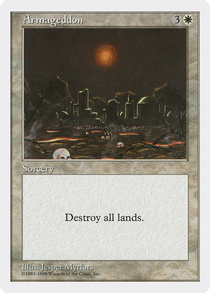
Alpha, Beta, Unlimited, Revised, IV, V, VI, Alter, Summer Magic

One must pay special attention to the first editions of cards to avoid confusing them.

ALPHA

These cards have black borders and are mainly distinguishable by their large, very rounded corners.

► No expansion symbol
► No copyright date"

BETA

These cards also have black borders and are mainly distinguishable by having less rounded corners.

No expansion symbol
No copyright date

UNLIMITED

These cards have white borders and can be distinguished from other white border editions by the presence of a second line next to the black border.

► Artist's name aligned in the middle of the lower border
► No copyright date
► Cards with the 'Tap' ability do not have the (T) symbol

REVISED

These cards have white borders and can be distinguished from other white-bordered editions by the absence of the second line next to the black border.

► Artist's name aligned on the lower border
► No copyright date
► Cards with the 'Tap' ability have the (T) symbol

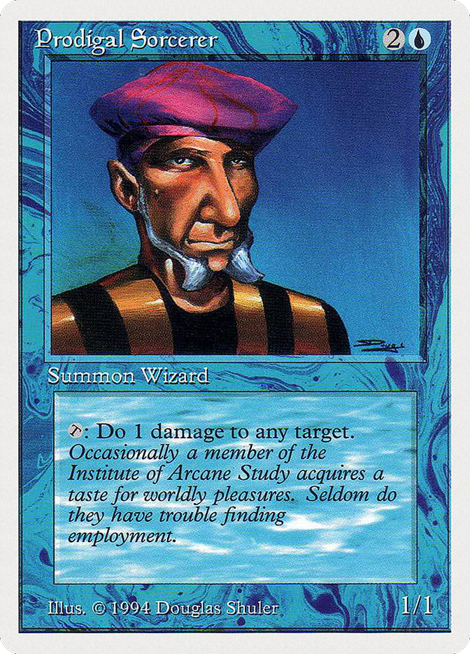
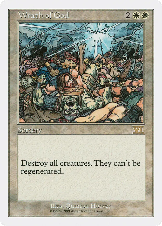
FORTH EDITION

These cards have white borders and can be distinguished from other white-bordered editions by the presence of a 'rounded' border.

Copyright '1995' Wizards of the Coast
► Cards with the 'Tap' ability have the (↷) symbol

FIFTH EDITION

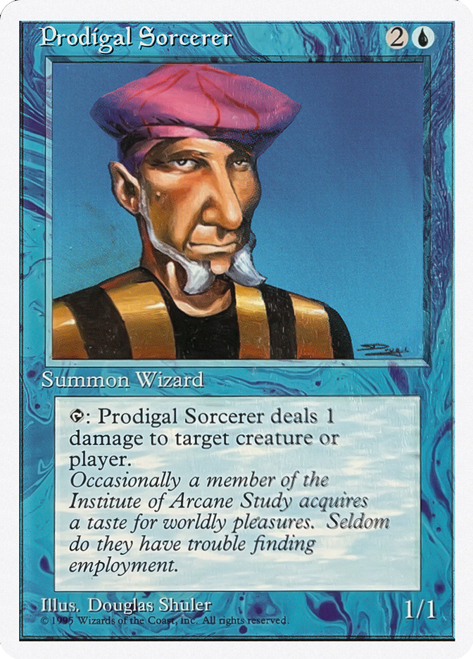
"Cards from the Fifth Edition can be recognized from the Fourth Edition by the copyright year.

Copyright '1997' Wizards of the Coast
► Cards with the 'Tap' ability have the (↷) symbol
► Saturated colors"

FORTH EDITION ALTERED

These cards have white borders and can be distinguished from other white-bordered editions by the presence of both a 'rounded' designed border and the '1995' Wizards of the Coast copyright at the bottom of the card.

► Does not react to UV light
► Upper portion of the 'A' on the back is darker
► Very glossy texture
► Different colors from other prints (more purple)

SUMMER MAGIC

This set looks a lot like Revised and Unlimited. There’s one key difference: the cards are all copyright 1994.

Copyright "1994" Wizards of the Coast
Cards with the "Tap" ability have the symbol (T)

ALPHA
No expansion symbol
No copyright date
► Round Corners

BETA
No expansion symbol
No copyright date

UNLIMITED
Artist name is centered in the bottom bar of the frame
No Tap symbol

REVISED
Artist name is lined along the bottom border.
Tap symbol is a slanted (T) in cards that have it.

IV EDIZIONE
copyright "1995" Wizards of the Coast
Tap symbol arrow (↷)

V EDIZIONE
► copyright "1997" Wizards of the Coast
Tap symbol arrow (↷)
Saturated Colors‍

IV EDIZIONE ALTERNATE
Does not glow under UV Light
Upper right portion of the "A" in the card back is darker
Glossy card texture
Different colors (they fail the dot test)

SUMMER MAGIC
Copyright next to artist name
Tap symbol is a (T) in card that have it

Chronicles, Anthologies, Battle Royale, Arabian Nights

You need to pay particular attention to first edition cards to avoid confusing them.
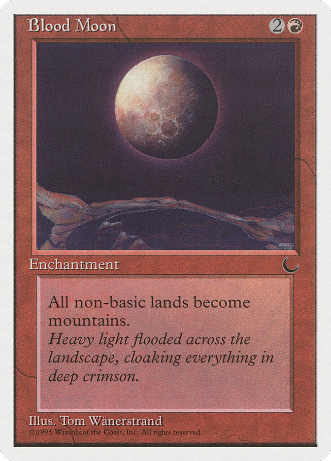
CHRONICLES
Bordi bianchi
Copyright ©1995
This is a reprint set of the cards from "Arabian Nights", "Antiquities", "Legends", and "The Dark".

CHRONICLES
White border reprint, Copyright ©1995

THE DARK
Black border, Copyright ©1994

ANTHOLOGIES
Bordi bianchi
Copyright ©1993-1998
"Anthologies" is a reprint set created to celebrate the game's fifth anniversary. It includes 85 reprints from every set released up until 1998.

ANTHOLOGIES
Copyright ©1993-1998

FORTH EDITION
Has Copyright ©1995

FIFTH EDITION
Has Copyright ©1997

BATTLE ROYALE
Bordi bianchi
Copyright ©1993-1999
This set contains reprints of cards from Chronicles (which included Arabian Nights, The Dark, and 15 other different expansions). The reprinted cards do not have any serial numbers.

BATTLE ROYALE
Does not have a serial number

SIXTH EDITION (VI)
Serial number (54/350)

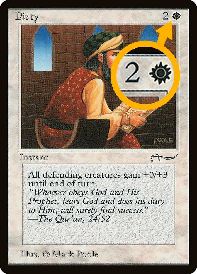
ARABIAN NIGHTS - MANA COST MISPRINT
Light Mana
Dark Mana
In the "Arabian Nights" edition, there are 15 common cards that have both light and dark variants.

Light Mana ► Lighter mana symbol and larger number in the colorless mana symbol

Dark Mana ► Darker mana symbol and smaller number in the colorless mana symbol

LIGHT MANA VERSION

DARK MANA VERSION

CHRONICLES
White border reprint
Copyright ©1995

ANTHOLOGIES
No expansion symbol
No copyright date

BATTLE ROYALE
White Border
Copyright 1993-1999
No collector number

ARABIAN NIGHTS
Light versions mana
► 
Dark version mana

The List, Secret Lair, Mystery Booster, Playtest

There are certain expansions of reprinted cards with a small difference compared to the original print: a small "planeswalker" symbol in the bottom left corner. These cards belong to the sets The List, Mystery Booster, or Commander Secret Lair

THE LIST
Symbol in the bottom left corner
The List reprints follow the original set's printing. Be sure to check the edition of The List cards, as some are reprints from different editions!

THE LIST
Reprint - Double Masters (2XM)

THE LIST
Reprint - Modern Masters 2017 (MM3)

MYSTERY BOOSTER
Simbolo in angolo a sinistra
This set collects reprints of cards with the Planeswalker symbol in the bottom left, just like "The List."

There are two editions of Mystery Booster: "Convention Edition" and "Retail Edition." The main difference between the cards in the two editions is the exclusive "Playtest" card found in both sets (see the next slide for more information).

MYSTERY BOOSTER
Square-boxed symbol

THE LIST
Round-boxed symbol

⚠︎ There is no significant difference between "Mystery Booster" and "The List" prints, so these cards are considered identical for sale.

However, it's possible to identify some cards printed in both sets due to a slight difference in the size and shape of the symbol in the bottom left corner.
PLAYTEST CARDS
Convention Edition
Retail Edition
Playtest cards are unofficial versions used to test new cards or mechanics, featured in the "Mystery Booster" set. They have simplified graphics and are not legal for official tournaments. There are two printings of playtest cards: only the limited first printing "Convention Edition" features the typical "The List" symbol, while the second printing "Retail Edition" does not have this symbol.

CONVENTION EDITION
First printing of test cards
Planeswalker symbol in the bottom left

RETAIL EDITION
Second printing of test cards
No symbol in the bottom left

ADJUSTED REPRINTS - The List Mystery Booster 2
Ten cards from Mystery Booster 2 were reprinted into The List as “adjusted reprints”. They have revised designs and layout and lack the typical planeswalker symbol in the lower left. Here are the ten updated cards that are missing the typical The List symbol:
COMMANDER SECRET LAIR
There are no differences, and it is not possible to distinguish the reprints included in the Commander Deck of the Secret Lair edition: they are identical to the cards in The List. The card's origin is provided for informational purposes only; on our platform, they will progressively be unified and managed as a single identical print (The List)

Showcase, Extended Art, Borderles, Retro-Frame

Cards printed in recent years often have alternate artworks or layouts designed to match each new expansion. However, it’s easy to get confused when trying to recognize and classify the different types of alternate cards. In this guide, you will find the official classification of the various alternate cards.
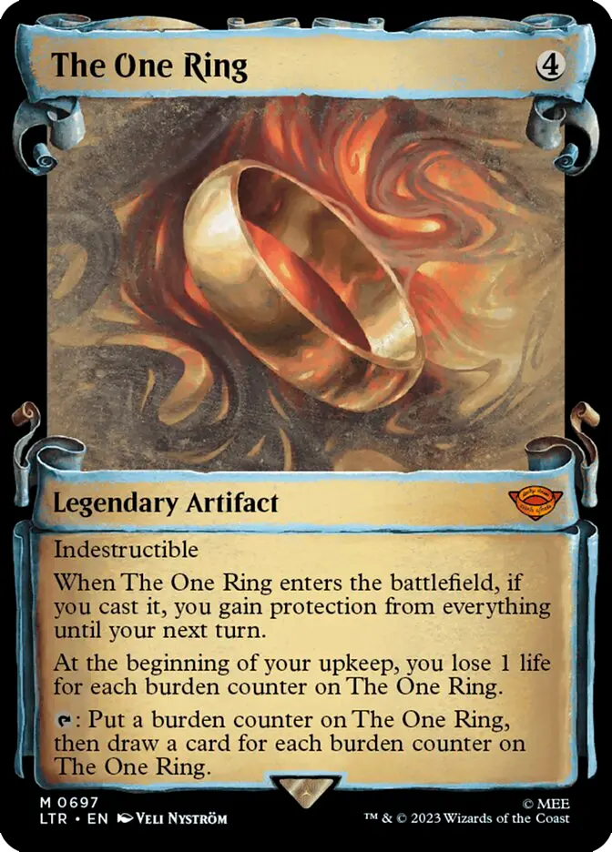
SHOWCASE
Alternative border
Alternative Art
Showcase cards were introduced with Throne of Eldraine. This term refers to the unique style of the card's frame and artwork, which changes from set to set, aiming to best represent the theme of each expansion.

REGULAR (246)

SHOWCASE (697)

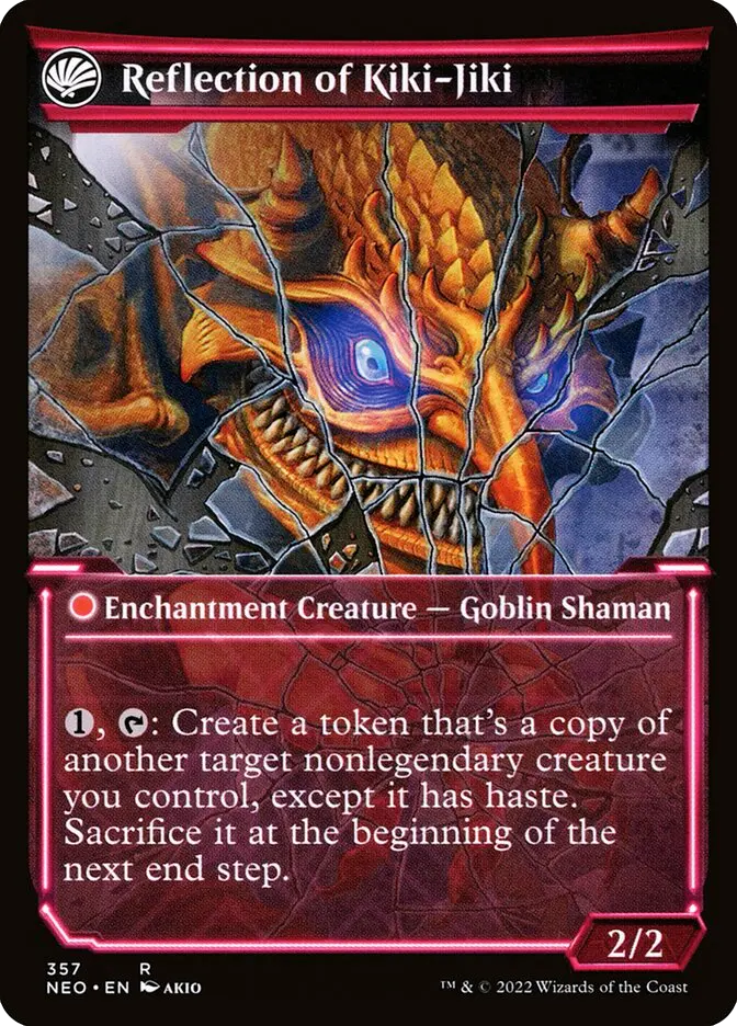
SHOWCASE - DOUBLE-FACED
Alternate artwork front/back
The "Showcase" versions of double-faced cards have a different layout and artwork compared to the regular version, making them easy to recognize.
(Click on the ↺ icon to rotate the card.)

Regular (141/302)

SHOWCASE (347)

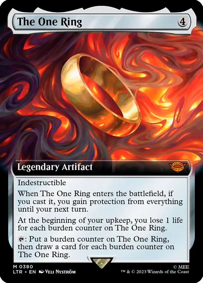
EXTENDED ART
Extended Artwork
"Extended Art" cards feature artwork that extends to the left and right sides while keeping the rest of the card’s layout intact. The text box might be slightly lowered depending on the amount of text.

REGULAR (246)

EXTENDED ART (380)

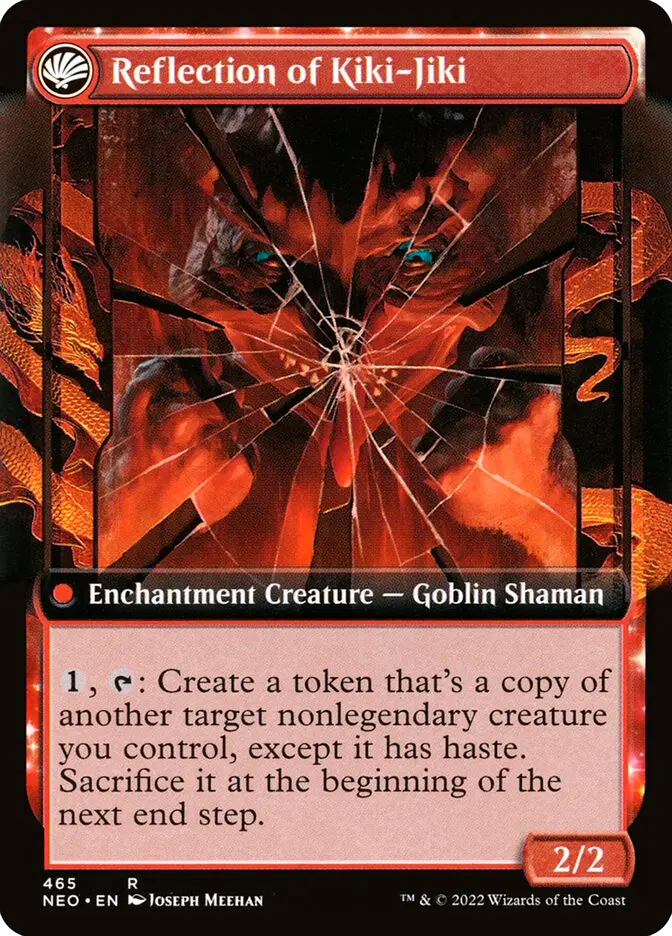
EXTENDED ART - CARTE BIFRONTE
Front non-extended
Back Extended Art
The "Extended Art" double-faced versions have the front print with the same layout as the "regular" version. Only the back has the extended artwork. Pay close attention to the serial number, as it helps distinguish them.
(Click on the ↺ icon to rotate the card.)

Regular (141/302)

SHOWCASE (465)

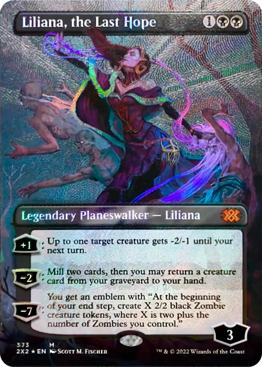
BORDERLESS
Alternative Art
Without borders
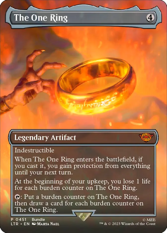
"Borderless" cards have no borders and feature a complete, alternative illustration to the original print. The artwork extends across the entire card, including the top and sometimes the bottom. Part of the illustration may be seen behind the text box.

BORDERLESS (451)

BORDERLESS (748)

BORDERLESS - DOUBLE-FACED
Alternative Art
Without borders
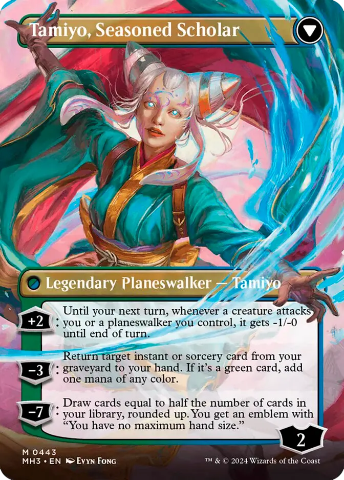
Double-faced "Borderless" cards are easy to recognize because they have alternative artwork on both the front and back of the card. They have no borders, making them easily distinguishable from "Showcase" cards as well.
(Click on the ↺ icon to rotate the card)

Regular (242)

BORDERLESS (443)

RETRO-FRAME
Old layout
The Retro Frame cards feature a layout that pays homage to the nostalgic old layout of the early expansions. These new cards come in two types of foil: "Pre-Modern Foil" and "Etched Foil."

OLD LAYOUR (Onslaught - 2002)

RETRO-FRAME (Modern Horizons 2 - 2021)

SHOWCASE
Altered border
Regular art

SHOWCASE - Front/Back
► Altered border front/back
► Art alternative front/back

EXTENDED ART
► Extended art on the sides
► Regular art

EXTENDED ART -Front/Back
► Extended art front/back
► Extended art only on the back in some cards (sagas)

BORDERLESS
Without border
► Alternative art

BORDERLESS - Front/Back
Borderless front/back
► Alternative art fronte/retro

RETRO FRAME
Old Layout
Regular Art

Pre-Release, Promo Pack, Serialized

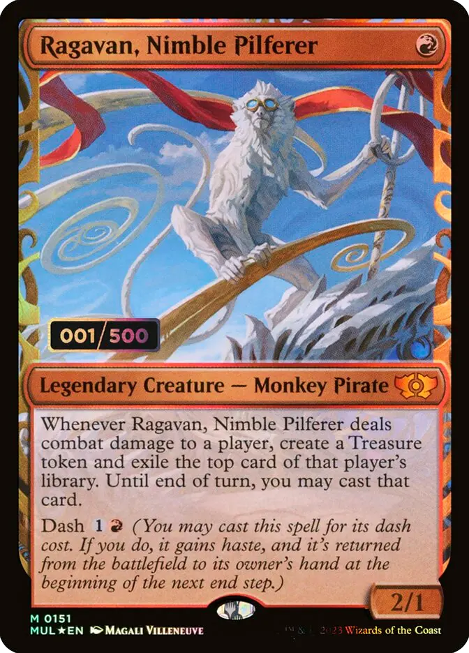
Magic: The Gathering has produced a wide range of promotional cards over the years, designed to reward players during special events or as part of exclusive products. In this guide, we will help you recognize the different versions of cards with overlays, so you don’t confuse them with each other or with their "regular" version.
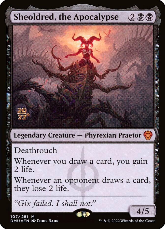
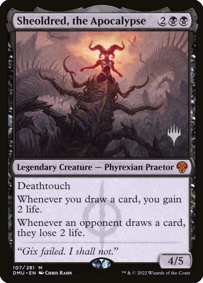
PRERELEASE
Data/Anno

These cards are given out during pre-release events and feature the event date printed in gold on the artwork.

► Date/year printed in gold on the card
► Always Foil

PROMO PACK
Simbolo

These promotional cards are distributed in Promo Packs and feature the "planeswalker" symbol printed in silver on the artwork.

► Silver symbol printed on the card
► Non-foil / Foil

SERIALIZED
Numero Seriale

These cards are given out during pre-release events and feature the event date printed in gold on the artwork.

Serial number printed in gold on the card ► Always Foil (Double Rainbow foil)

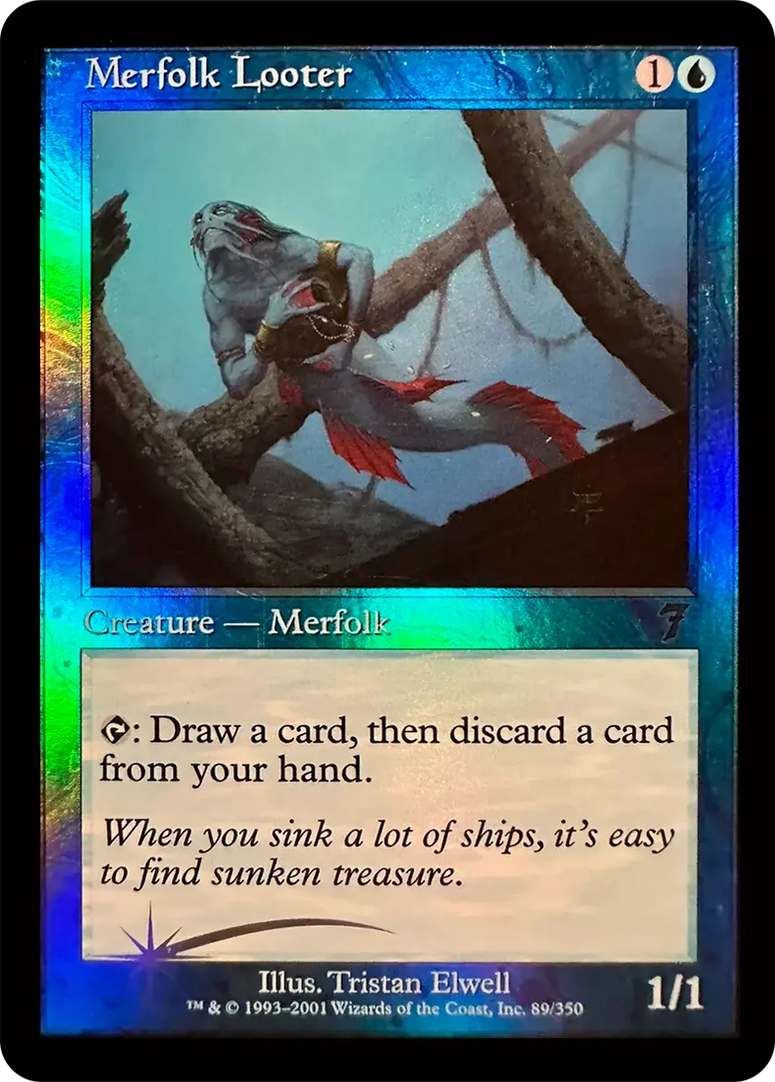
Recognizing the type of foil

Over the history of MTG, the layout of cards has changed significantly. Recently, starting from 2020 expansions, new types of foils have been introduced, which are unique and quite different from each other, although they can still cause confusion when trying to distinguish them from the classic original foil.
On CardTrader, cards that feature a version different from the classic foil are clearly marked and easily recognizable thanks to the version listed in parentheses next to the name.
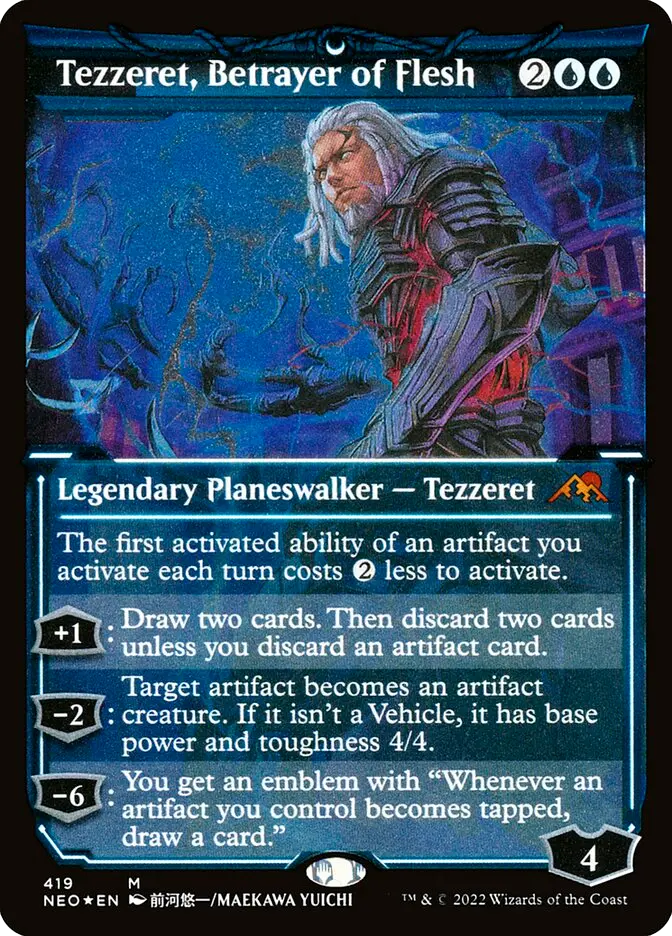
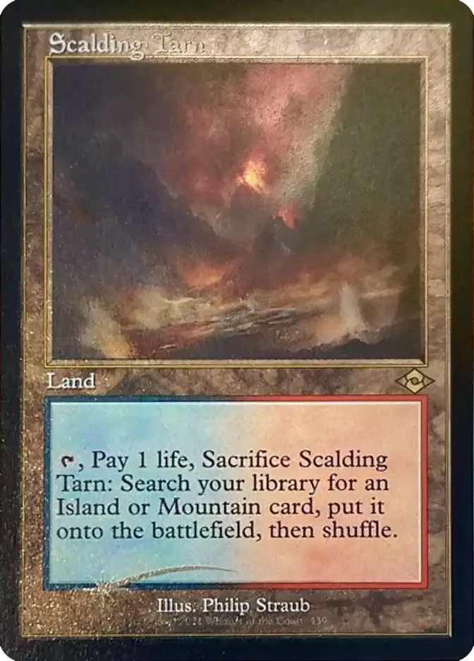
ETCHED FOIL
Matte foiling
"Etched" foil cards are slightly matte and less glossy in the foil parts. They also have a rougher finish compared to traditional foils, which causes them to reflect less light.

REGULAR FOIL
► Regular rainbow foil across the entire card
Star ★ next to the set code

ETCHED FOIL
► Matte etched foil across the entire card
Star ★ next to the set code

CARTE RETRO FRAME FOIL
Symbol
Retro-frame cards, when foil, feature a "comet star" printed at the bottom. Be careful to distinguish between "classic foil" and "foil-etched" versions, as they are two different types.

REGULAR FOIL - RETRO FRAME
Regular rainbow foil
Holographic comet star at the bottom

ETCHED FOIL - RETRO FRAME
► Matte and rough-to-the-touch etched foil
► Etched comet star present at the bottom

MYSTICAL ARCHIVES

Cards from the Strixhaven Mystical Archive can be:
► Non-foil (● next to the serial number indicates the card is not foil)
► Traditional foil (★ next to the serial number indicates the card is foil)
► Foil etched (★ next to the serial number, the number will be different from the regular foil card)

ETCHED FOIL
The etched foil is partial compared to the classic foil, appearing only in the decorative gold border layout.

ETCHED FOIL -  (JAPANESE)
The etched treatment is present only in the thin border lines and the set symbol.

CARTE BORDO BIANCO
 
Foil black border
Cards from the "6th Edition" and "7th Edition," which normally have a white border, instead have a black border in the "foil" version.

NON-FOIL WHITE BORDER
Regular non foil card

FOIL WHITE BORDER
Foil card with a black border
► Features a foil comet star at the bottom

TEXTURED FOIL
Textured surface
A tactile treatment applied to the entire card. It features its own distinct serial number. This treatment is very subtle in the "Dominaria United" set, with only a faint texture.

TEXTURED FOIL
Visible texture across the entire card
Different serial number from the non-foil/classic foil version.

TEXTURED FOIL (Dominaria United DMU)
Very light texture, similar to etched cards
Serial number from 328 to 368

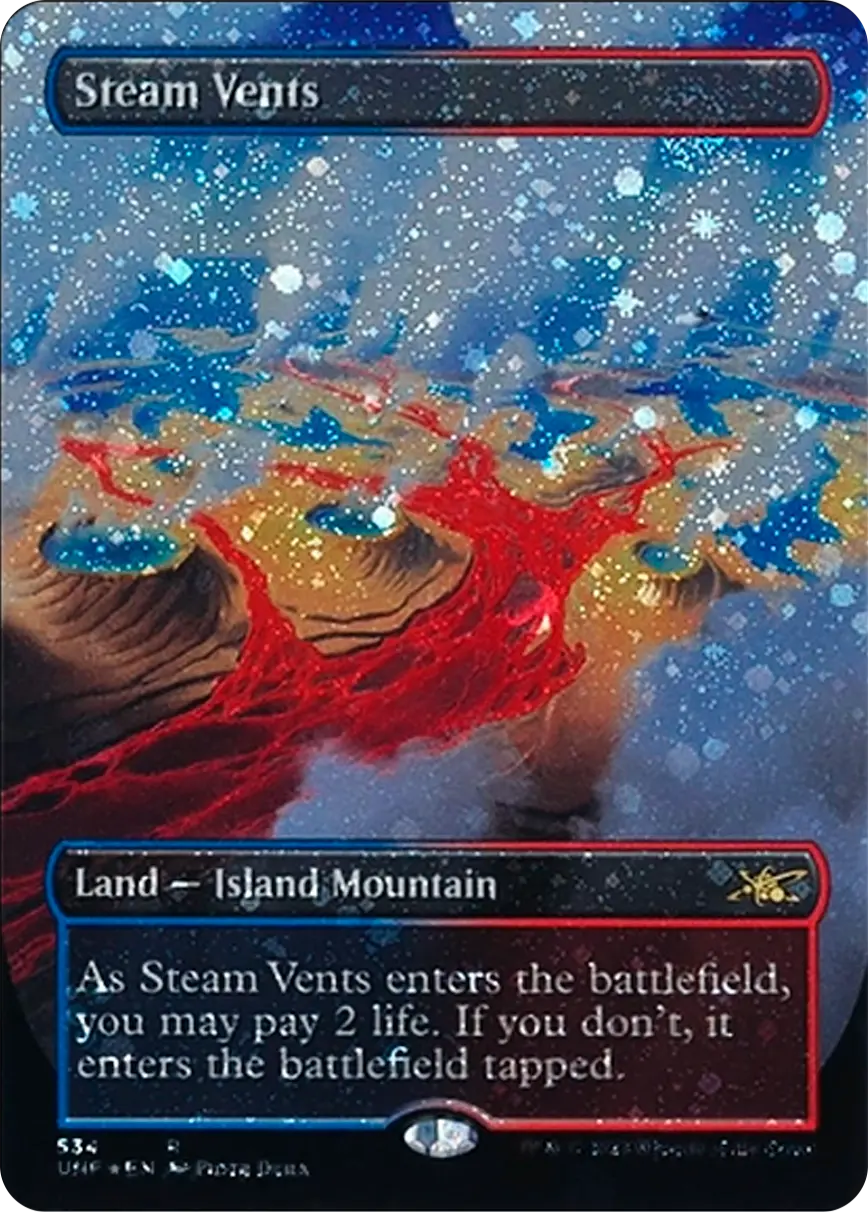
GALAXY FOIL
Galaxy pattern
"Galaxy" foils have a bright and reflective appearance, very similar to the holo cards from the Pokémon Base Set. As the name suggests, this new type of foil resembles the galaxy, emphasizing the planets and stars that appear in the card’s treatment.

FOIL CLASSICO
Regular Rainbow Foil

FOIL GALAXY
► Galaxy foil pattern

OIL SLICK FOIL
Embossed texture

Available only in the "Compleat Edition Bundle" of Phyrexia: All Will Be One.

► Visible texture across the entire card
► Unique artwork (cards exist only with this foil treatment)

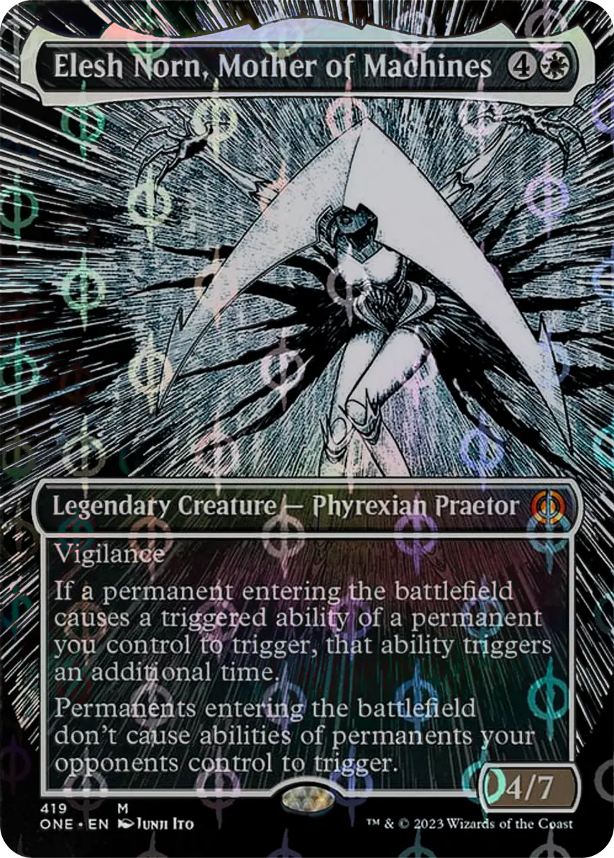
STEP-AND-COMPLEAT
Foil symbols

The "Step-and-Compleat" uses the Phyrexia symbol as a stamp layer for the foiling process.

► Holographic symbol repeated across the entire foil card
► Serial number from 417 to 479

RAISED FOIL
Embossed foil details

A new treatment for some cards in the Outlaws of Thunder Junction and Bloomburrow sets.

Embossed foil on the borders or gold details of the card
► Distinct serial number

SURGE FOIL
Diagonal wavy foiling

A treatment with intense reflections, varied texture, and a vibrant metallic effect.

► Wavy, very bright diagonal foiling
► Distinct serial number

HALO FOIL
Wavy foiling

Introduced in March of the Machine, this foiling expands in a movement of rainbow lines across the entire card.

► Serial number: from 186 to 228 are halo foil.
► Rainbow wavy foiling

RIPPLE FOIL
Circular foiling

Foiling introduced in Modern Horizons 3, it appears circularly across the entire surface of the card, resembling the ripple of water.

► Foiling with intersecting circles
► Distinct serial number

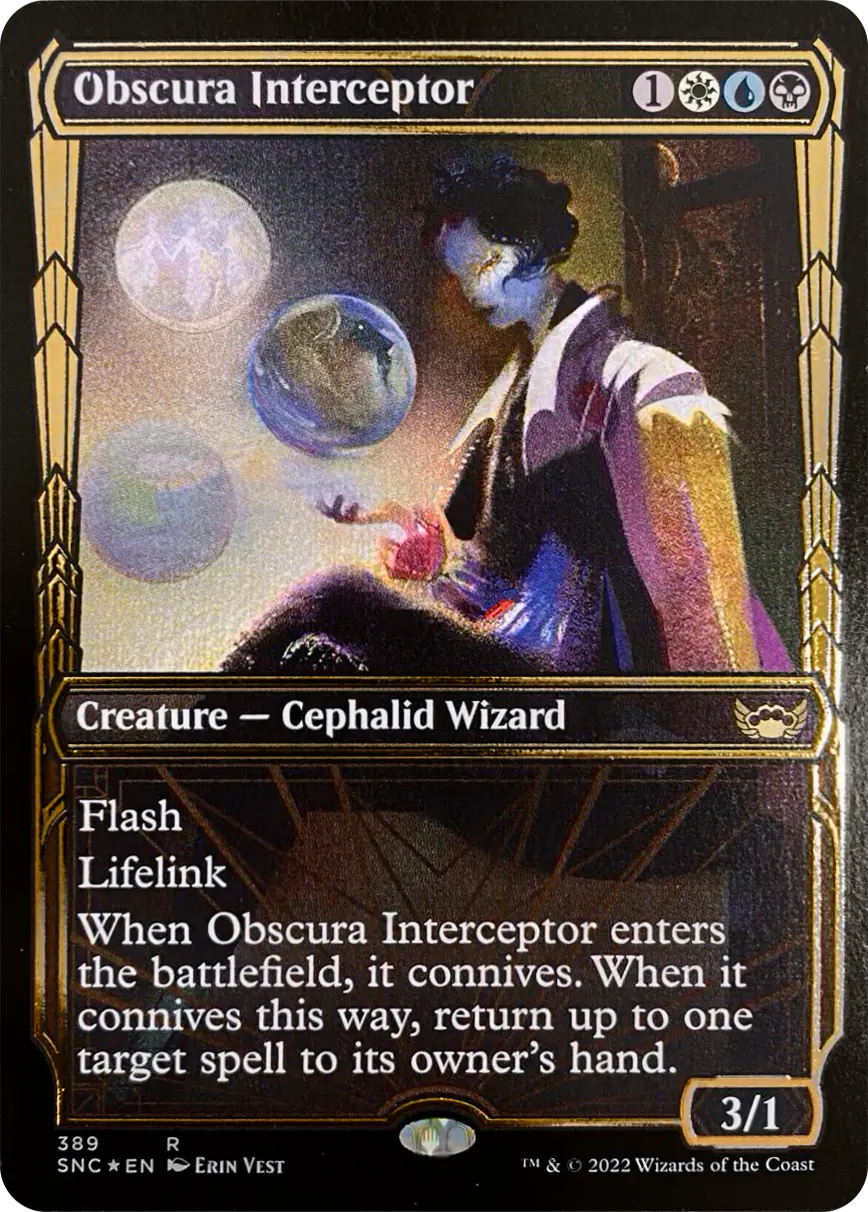
GILDED FOIL
Embossed gold foiling

First introduced in Streets of New Capenna, the "Gilded Foil" is a new type of embossed foil applied only to the gold border of multicolor Showcase cards. To distinguish it from traditional foil cards:

► Serial number: from 361 to 405 are gilded foil.
► Embossed foiling applied only to the gold border

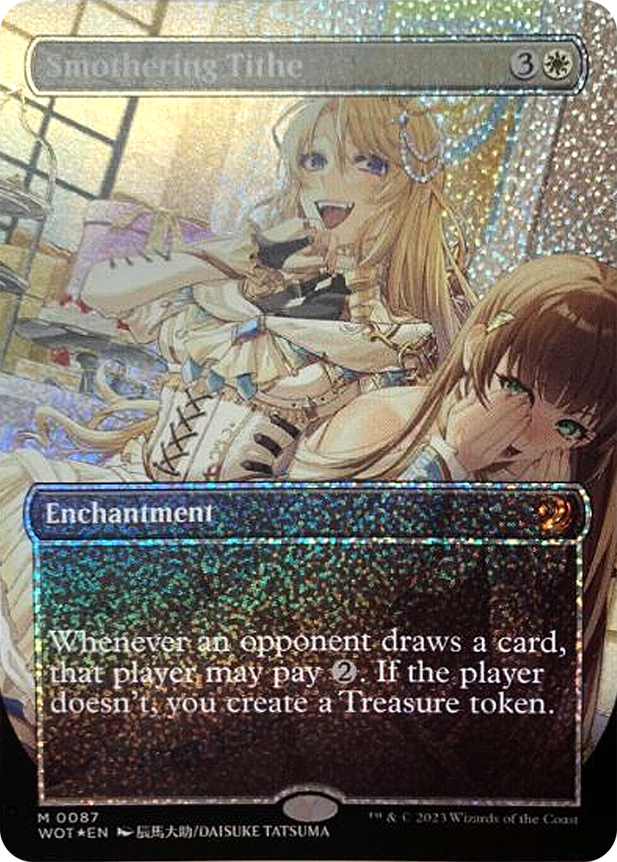
CONFETTI FOIL
Dot-patterned foiling

Introduced in the Wilds of Eldraine: Enchanting Tales set, the "confetti" foil is easily recognizable by:

► Serial number: from 084 to 103 are gilded foil.
► Dot-patterned foiling present on most of the card.

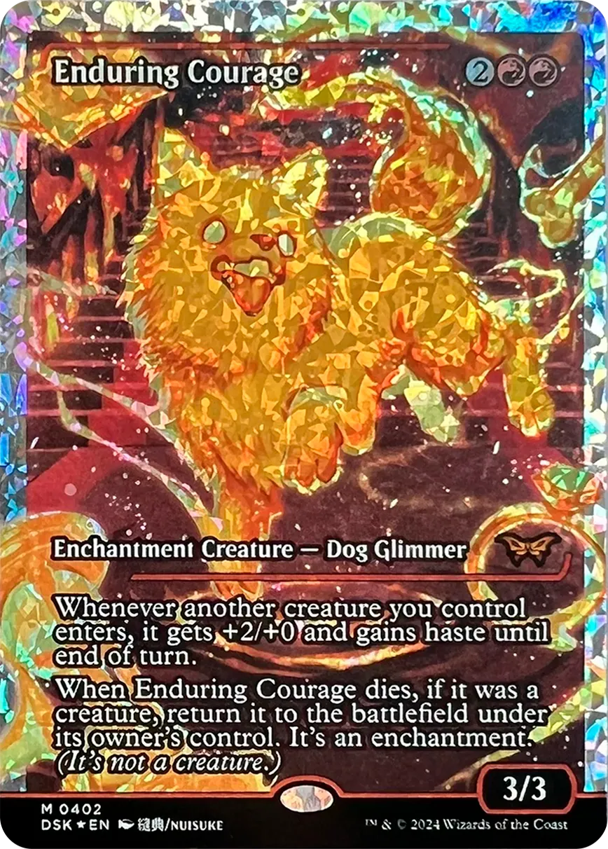
FRACTURE FOIL
Fragmented foil

Foil applied to the "Japan Showcase" cards from the Duskmourn: House of Horrors set. They are easily recognizable from the regular "foil" version by:

► Serial number: from 396 to 405 are fracture foil.
► Rainbow fragmented foiling
► Silver borders with fragmented foiling

ETCHED FOIL
Matte foiling

RETRO-FRAME
Foil cases

MYSTICAL ARCHIVES
Casi di foilatura

6th e 7th EDITION
► 
Black border foil

TEXTURED FOIL
Foil with texture

GALAXY FOIL
Galaxy pattern

OIL SLICK FOIL
‍‍►Embossed foil on black

COMPLEAT FOIL
Foil with symbols

RAISED FOIL
Embossed foil details

SURGE FOIL
Diagonal foiling

HALO FOIL
Wavy foiling

RIPPLE FOIL
Circle foiling

GILDED FOIL
Embossed gold foil

CONFETTI FOIL
Dotted pattern foil

FRACTURE FOIL
Fragmented foil

Art Series and WCD signature

In this chapter, we will explain how to recognize a card with a "stamped" signature (not to be confused with "signed" cards, which are hand-signed by the artist using markers).
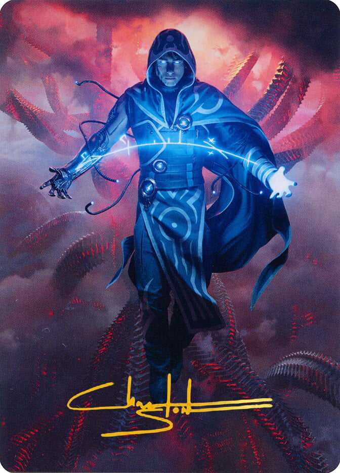
ART-SERIES
Gold-Stamped
The "Art Series" cards are collectible bonus cards that are not playable, usually found in Set boosters and Play boosters. These cards are never foil but can be of two types: regular or gold-stamped.

Note: Cards with the planeswalker logo stamped instead of a signature are also considered "Gold-Stamped."

REGULAR

GOLD-STAMPED

REGULAR

GOLD-STAMPED

WORLD CHAMPIONSHIP DECKS - Identical cards
Alternate artwork front/back
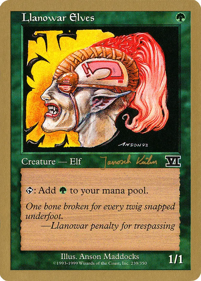
The gold-bordered cards are part of the "World Championship Decks." These cards are not legal for use in official tournaments and are distinguished by their gold border and a different back from standard cards. The set contains identical cards with different signatures, as they come from decks of players who participated in the World Championships.

Although the card has the same name, image, and functionality in both decks, the player's name printed in the bottom-left corner (stamped, not hand-signed) indicates which championship deck the card comes from.

"Nicolas Labarre" Deck

"Janosch Kühn" Deck

SIDEBOARD - WCD
SB Logo
The gold-bordered cards are part of the "World Championship Decks." These cards, not legal for use in official tournaments, are distinguished by their gold border and a different back from standard cards.

Important: Pay attention to the "SB" stamp on some cards. This indicates that the card is part of the deck's sideboard and is a different card from the normal version.

REGULAR

SIDEBOARD (SB)

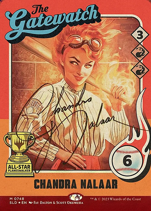
SECRET LAIR - Signed cards
Printed signature
Some Magic: The Gathering cards released in Secret Lair editions feature a special variant with a unique serial number. This version, which may look identical to its base version at first glance, includes a printed signature above the name of the character depicted on the card, as if it were autographed by the character themselves.

REGULAR (SLD 1456)

SIGNED (SLD 0748)

ART SERIES
Regular
Gold Signed

WCD - Identical Cards
Same card, different player signature

WCD - Sideboard
Regular
Sideboard (SB)

SECRET LAIR - signed cards
Regular
Signed

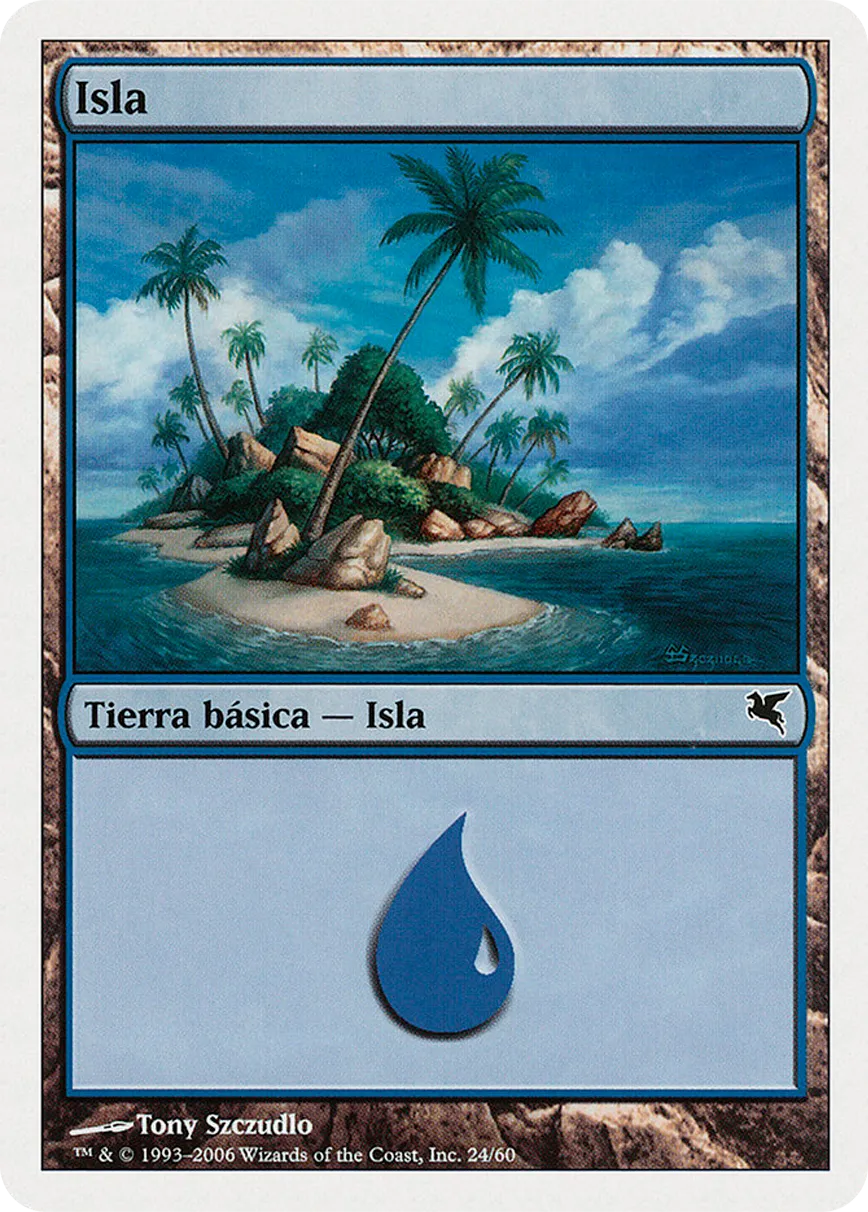
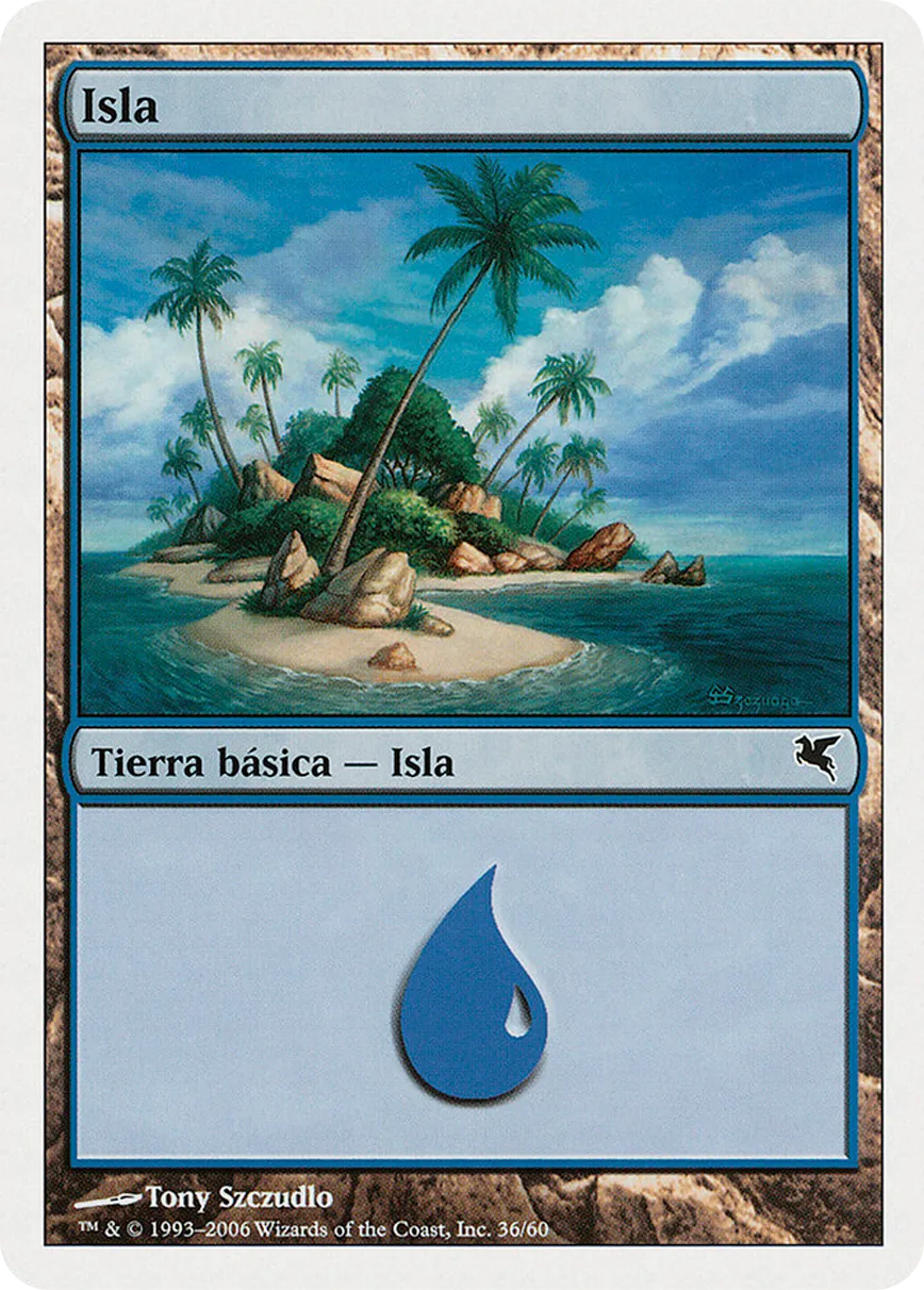
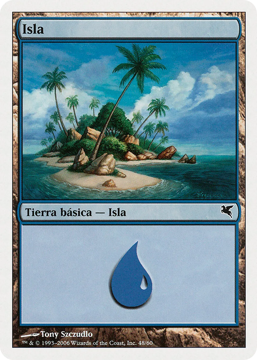
Salvat: identical cards with different collector number

The SALVAT edition of Magic: The Gathering is a collection of cards produced in collaboration with the publishing house SALVAT, aimed at making the game more accessible to a wider audience. These editions often include iconic and popular cards. They may feature replicas of classic cards with updated or specific designs.

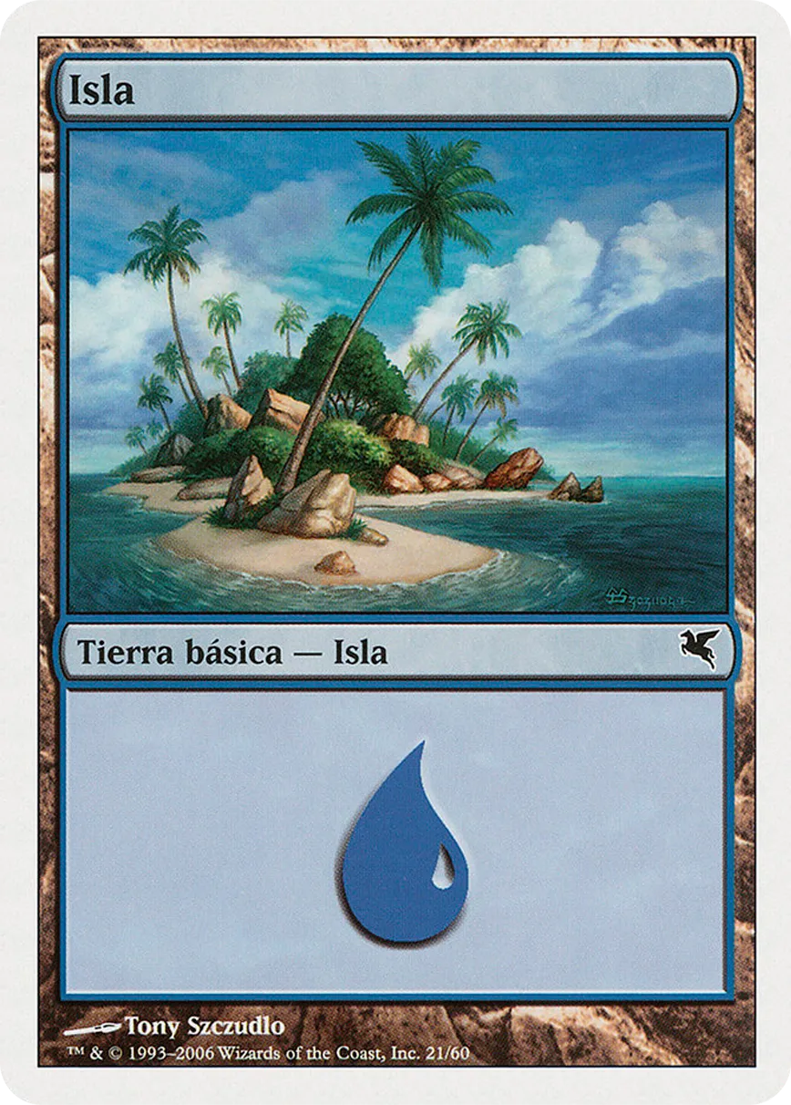
To distinguish identical cards within the same SALVAT edition, always check the serial number printed on the bottom border of the card.
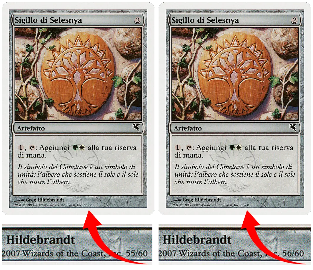
The SALVAT edition features many identical cards, distributed across different "theme-decks."
The card's serial number changes depending on the theme-deck in which the card was included.
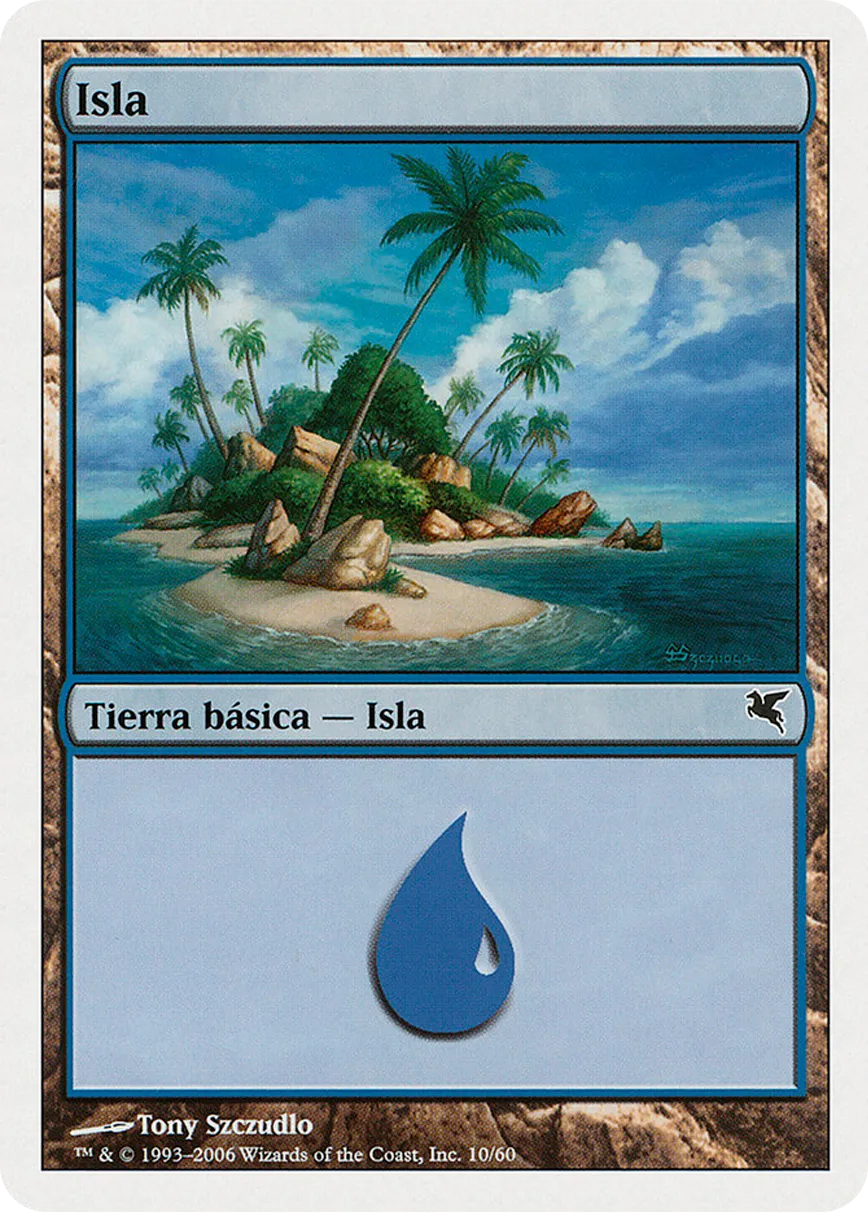
Island (10/60)

Island (21/60)

Island (24/60)

Island (32/60)

Island (36/60)

Island (48/60)

Differences in European, Japanese, and American printing

Magic: The Gathering cards printed in Japan are not limited to Japanese versions. English, Chinese, Korean, and other languages are printed in Japan but distributed worldwide. The same applies to cards printed in Belgium and the United States.

Before 2016, the printing technologies in Belgium, the United States, and Japan were very similar. Between 2016 and 2018, WotC announced that the printing process in Japan had changed. In particular, they highlighted that cards printed with the new technology have different fluorescence, surface texture, cut, and stiffness due to the paper used being different. Although more than five years have passed since the printing technology adjustment, many of the differences mentioned above are still unclear to many collectors, players, and sellers.

The print quality can also vary depending on the product: many times, the cards found in "Fat Packs," "Prerelease Kits," or preconstructed decks have lower and different print quality compared to those found in regular booster packs of the main set. As you can see in the image, the difference is often easily noticeable by the color gradient, ink intensity, and print quality.

Weight and Thickness of Cards


Cards printed in Japan cover many languages, so they are not only Japanese versions. Cards in English, Chinese, Korean, and other languages are also printed in Japan but distributed globally. The same applies to cards printed in Belgium and the United States.

The weight of MTG cards differs depending on whether they have the classic back or are double-faced. The same applies to token cards, Art Series, and promotional cards.

▸There are significant differences in the weight of cards printed in Belgium, the United States, and Japan.
A non-foil card with the classic back printed in Belgium or the United States weighs about 1.78g, while the same card printed in Japan weighs about 1.63g.

The production standard differs because in Japan, cards are made with more expensive material to be recyclable (as required by law), which results in different color and thickness compared to those printed in the EU and the USA.[As shown in the image, the difference in thickness is clearly visible when comparing two stacks of cards printed in Belgium and Japan.]

▸The weight of the cards can also be affected by "production errors".
For example, there have been reports of errors in the production of double-faced cards from the Ixalan set (printed in different languages) because a different cardstock was used. The cards from this set are lighter, with foil versions weighing around 1.35g–1.40g. [This difference could make you think you're dealing with proxies, even though the cards are authentic!]

It is more complicated to determine the average weight of foil cards since the printing method has varied over the years. Over time, different types of foiling (etched, full art, galaxy, etc.) have been implemented, which may result in many print variations from country to country.

Text Differences


Although the fonts and sizes are the same, the text on cards printed in Japan has better-defined edges, with characters appearing thinner compared to cards printed in Belgium or the United States.

Magic: The Gathering cards are printed using a process called "offset printing." In offset printing, each of the four print colors (CMYK) is printed separately from the others. Additionally, there is a second layer of black specifically for the text and borders of the card.
The separate printing of each color can lead to errors for each color
: the individual or multiple color channels may have incorrect ink consistency, may be obstructed by something (such as a stain), or the rubber rollers may not be properly cleaned between passes, resulting in various printing errors.

Edge Cutting Differences


The differences in card production are not only due to the printing machines but also to the cutting machines. One of the most significant differences concerns the type of corner cut, which can help identify whether a card was printed in Belgium, the United States, or Japan.


It is possible that U.S. or Belgian cards have one or two corners perfectly rounded like the Japanese cards. However, the remaining corners will be sharper, and the overall print quality will still not match the Japanese counterpart. The corners of U.S. cards are slightly sharper than those printed in Belgium, but they share the same curvature.

To summarize, Japanese cards have more rounded corners, U.S. cards have less rounded corners, and Belgian cards fall in between.

Note: There are sets (such as Alpha and Beta) where the edges are universally cut as rounded, less rounded, or sharp, regardless of the country in which the cards were printed.

Differences in Foiling and Surface


There are significant differences in the brightness of the surface of foil cards printed in Japan, Belgium, and the United States. The surface quality of cards printed in Belgium and Japan is generally superior to that of their counterparts printed in the United States.

Looking at Full-Art cards (Planeswalker Alternate-art, Borderless, or Extended Art) from Collector Boosters, the versions printed in Japan show a finer granularity in the foiling, a less intense reflection, and a smoother surface.

To protect the cards from everyday wear, a varnish is applied during printing, which is one of the main factors responsible for the shine. The coating can vary from country to country, leading to significant differences in tactile texture and brightness.In the image, we can observe the difference between an Oracle of Mul Daya printed in the United States and one printed in Japan, both from the Double Masters 2022 expansion. The Japanese version (on the left) has a smoother surface and more diffuse reflectivity, while the American version (on the right) has a darker finish, more contrasted colors, and a direct reflective effect.

The surface of cards printed in the United States is rougher, a texture that can be easily felt by touch. In contrast, the surface of cards printed in Japan is smoother and more even.

In some recent sets (such as Mystical Archives or the new basic lands from Innistrad: Midnight Hunt and Crimson Vow), there is a noticeable difference in the "thickness" of the layout details on the cards.

For example, the expansion symbol and the border lines on cards printed in Belgium and Japan are well-defined and raised compared to the rest of the card and the foiling. Cards printed in the United States, on the other hand, do not have this raised detail, maintaining a uniform foiling across the entire surface.

[Right: Japanese printing. Left: American printing.]


his difference in "raised details" is particularly evident in the Kaladesh Inventions, another example of variations between print shops.

The versions printed in the United States are entirely foil, with a visibly glossy and uniform surface. In contrast, those printed in Belgium have foiling limited to the border frame, which appears matte and raised.

Cards printed in Japan are similar to those printed in Europe, with the slight difference of having an even more matte and raised foiling, making them less reflective under light.

[Right: European matte foil print. Left: American glossy foil print.]

Color Differences


Although one might think there is a standard production process, Wizards of the Coast has used different types of paper over the years. The quality of the paper has improved over time and is now fairly consistent, with some exceptions. This aspect affects the weight and color of the cards. There are various sets that might seem unusual or even counterfeit simply because they were printed on a different type of paper.

The color of the card can vary in hue (from white to yellowish, from red to orange) or appear lighter or darker depending on the country of origin where it was printed. For example, in Japan, the whitening process of the paper uses different chemicals compared to those used for most European cards, as the fibers used are also different. The composition and structure of the paper significantly influence the final result.

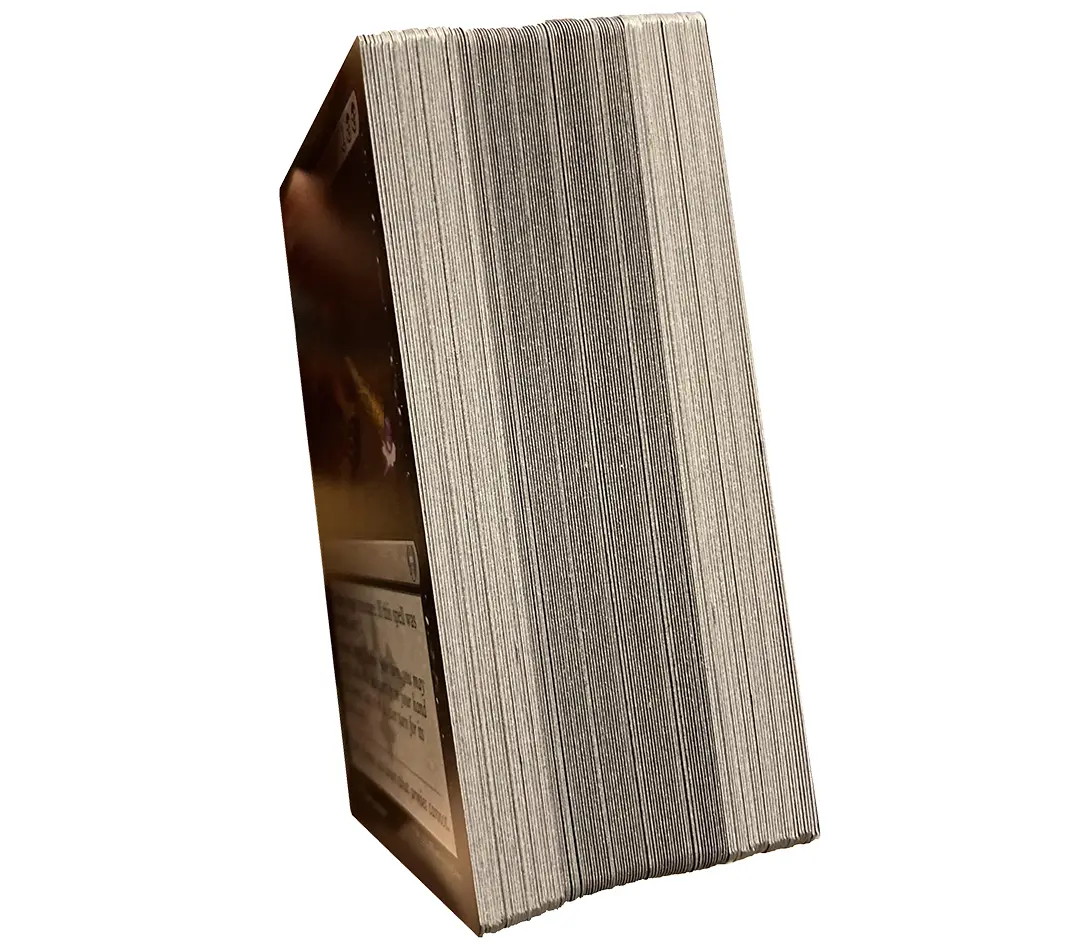
Magic: The Gathering cards are composed of multiple layers, with a colored plastic layer in the center that forms the core of the card. Most sets printed in the United States have a blue core, while sets printed in Japan have a purple core.

This characteristic makes it fairly easy to distinguish them, as the edge of cards printed in Japan appears darker. The foiling process introduces another variable: in general, the type of white used in the card determines how it reacts to UV light. Cards produced in Japan have a protective UV coating, so they do not react to UV light. As shown in the image below, exposing the cards to UV light reveals clear differences in colors.

TEST UV - Japanese print (left), American print (right)

Foil European print (left), Foil American print (right)


These protective coatings are a standard practice in the playing card industry but were not adopted until Wizards of the Coast began producing cards specifically for the Japanese market, opening a printing facility in Japan.

Other printing facilities outside of Japan do not yet apply this coating, likely to reduce production costs. Additionally, cards printed in Japan use a different cardstock because they must be recyclable, as required by Japanese regulations.

In contrast, cards printed in Texas are not required to meet this standard, and so Wizards of the Coast does not use recyclable cardstock for them, presumably due to higher costs.

(*Japanese laws require that cards be recyclable. Traditional cards are not recyclable due to the plastic in the core and the plastic/metal present in foil cards, necessitating adjustments and changes to some materials.)

Japanese and European prints generally have a brighter appearance in images, while U.S. prints appear darker.

Main Differences Between American and European Cards

Western printed cards (TCG) are commonly distinguished as "American" and "European" cards due to differences that are well-known to most players and collectors. Here are the main printing differences:

BRIGHTNESS
USA: lighter print
EU: darker print

European cards have a darker color tone across the entire card, while American cards are lighter. The use of darker ink compared to American cards makes them of superior quality.

TEXT
USA: bolder card text
EU: lighter card text

European cards have a darker color tone across the entire card, while American cards are lighter. The use of darker ink compared to American cards makes them of superior quality. The text on American cards is slightly thicker and darker because the background color is slightly different from the European one (lighter), which tends to appear shinier and has a slightly darker finish.

FOIL
USA: bright and linear foil
EU: matte foil with more texture

American Secret Rare and foil cards have a lighter image, with brighter foil, especially in the card name, and a more linear pattern (less glittery) compared to European cards (which appear darker and less reflective). The American foil covers the entire card and is subject to "warping" (curving), while European cards have localized foil with slightly better resistance to warping.

TONALITY
USA: vivid colors tending towards purple
EU: less saturated colors

American prints tend to lean more towards purple compared to European prints. American cards often have more vivid and saturated colors, while European cards tend to have softer and slightly more opaque colors.

WEIGHT
USA: <1,65g
EU: >1,65g

A typical Yu-Gi-Oh! card weighs around 1.65g, but this can vary depending on the edition, rarity, and type of foil. The weight also differs between American and European prints. As noted in examples, American cards usually weigh less.

American 1.53g

European 1.69g


Some people find that the cards printed in Europe are of higher quality than the American ones, especially the holo/foil cards, which have a better print quality as they are much brighter and more colorful. These are "differences" rather than "quality." Essentially, the rarity of European cards in America makes them more valuable because they are different and harder to find. The same applies to American cards, which are known to be visually different and more sought after by European players.

Thanks to our platform, it has become easier to obtain cards from sellers around the world, allowing the American and European markets to cross over with different prints. With this guide, we aim to reassure our users to recognize the authenticity of cards if they show print differences.

"Sky Striker Ace - Raye"
American (left) vs European (right)

"Timestar Magician"
American (left) vs European (right)

Oriental Cards (OCG)

Yu-Gi-Oh! is a collectible card game that takes place in two distinct worlds: the Trading Card Game (TCG) and the Official Card Game (OCG). Cardtrader currently does not handle cards related to the Eastern market (OCG Duel Monster Card Game).

Therefore, we kindly ask you not to upload cards belonging to the OCG "Asian English" or "Asian" prints, as they belong to different expansions from the TCG, have different rarities and prints, and are not playable in TCG tournaments due to a.
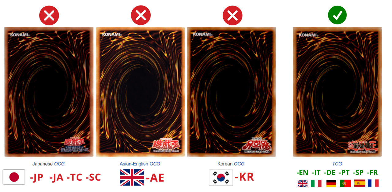
Cards printed in Asia may have slight differences if printed in Japan or other countries (e.g., Korea).

Japanese-Asian cards ("Japanese-Asian") are Japanese cards produced and intended for sale in Asian countries outside Japan.
They are commonly abbreviated as JA  but listed as JP in the card set number. Cards printed in Japan (JP) have better print quality (paper and contrast) compared to cards printed in other countries (JA).

For higher rarities like "Secret Rare," the foil pattern is also different: JA would have a horizontal pattern, while JP would have a vertical pattern.

How to Recognize all Rarities

The rarity of Yu-Gi-Oh! cards is linked to the characteristic coloration of the card's name, differences in the foiling appearance, and textures. In this guide, we will explain how to avoid confusing lower rarity cards with higher rarity ones, and help you correctly list your items for sale.

COMMON
C

The card name has only black text — if it's a Monster card. Common Spells, Traps, and XYZ Monsters, on the other hand, have the name text in white.

►Card name in white or black
►Non-foil

RARE
R

Rare cards are similar to Common cards, except that they use silver or black holographic foil for the card name letters.

►Gray card name (or outlined in gray)
►Non-foil

SUPER RARE
SR

Super Rare cards are foiled in the card's image, attributes, and level of power. The foil is the classic smooth rainbow foil.

► Non-foil card name
► Rainbow foil
(image and attributes)

ULTRA RARE
UR

Ultra Rare cards are a combination of Super Rare and normal Rare cards, with a holographic name and holographic image. The difference is the name printed in gold foil instead of silver or black..

►Gold card name
►Rainbow foil (image and attributes)

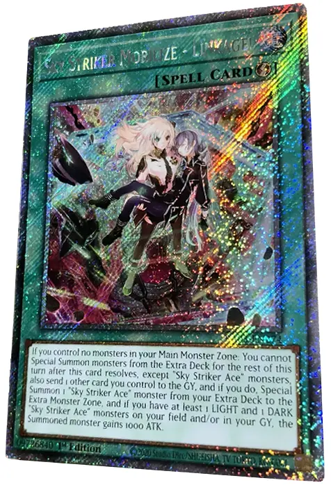
SECRET RARE
SEC

Secret Rare cards have a holographic silver name, with the image featuring a rainbow-colored diagonal line foil pattern.

►Holographic name
►Diagonal dashed foil(image and attributes)

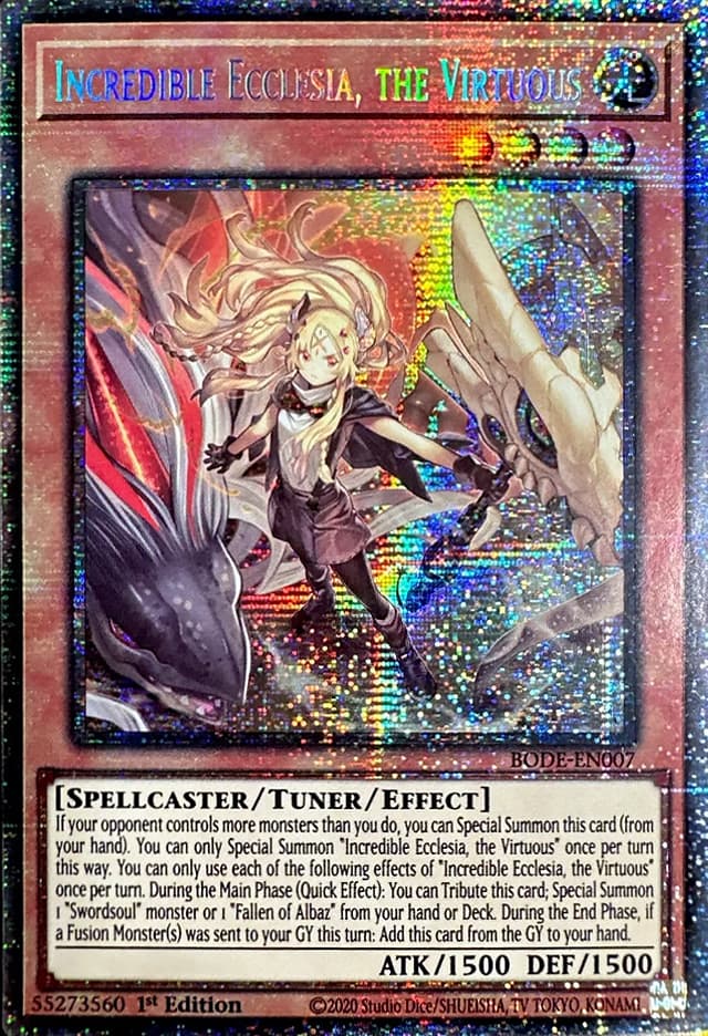
PRISMATIC 
SECRET RARE
PSEC

They are similar to Secret Rare cards, with the difference that the holographic image has a vertical and horizontal dashed foil pattern.

►Holographic name
►Perpendicular dashed foil
(image and attributes)

STARLIGHT
SL

Horizontal holographic pattern of a Prismatic Secret Rare applied across the entire surface of the card (similar to the Quarter Century).

►Holographic card name
► Perpendicular dashed foil on all card
(except for the text box)

QUARTER 
CENTURY 
SECRET RARE
QSEC

The holographic horizontal pattern of a Prismatic Secret Rare is applied across the entire surface of the card (similar to the Quarter Century cards).

►Golden holo card name
►Watermark "25th" in the text
►Light cross-hatch foil
(also outside of the image)

GHOST RARE
GH

It has faded colors that give the card a pale appearance. The image appears three-dimensional when tilting the card under light.

►Holographic silver name
►Pale foil image
(artwork hard to see)

ULTIMATE RARE
UL

The graphics, borders, and the type/level/rank of the card’s attributes have a slightly raised texture. The card appears very dark and matte, with the name printed in gold foil.

►Gold card name
►Matte textured foil
(image, attributes, and borders)

GOLD RARE
GR

It has gold lettering and a foil image like the Ultra Rare, but with the image border, text border, and card border all in gold.

►Gold card name
►Gold layout

PREMIUM GOLD
PGR

It has thick gold borders and frames that are perceptible to the touch, even in the image. The level stars are thick and visibly raised compared to the red circles.

►Gold card name
►Gold layout
(attributes and borders)

GOLD SECRET
GSEC

It has gold lettering and the foil of Secret Rare, with the image border, text border, and card border all completely gold.

►Secret style card name
►Secret foil
►Gold layout

GOLD GHOST
GGH

HIt has gold lettering and the Ghost Rare image, with the image border, text border, and card border all completely gold.

►Gold card name
►Ghost Rare image
►Gold layout

COLLECTOR'S
CR

It has a rainbow/pearlized name, foil accents on the level stars and icons. The card's border is foil with a textured pattern resembling "fingerprints."

►Holographic name
►Holographic texture
(image, borders, attributes)

PLATINUM RARE
PL

Exclusive rarity from the "Noble Knights of the Round Table Box Set." The card's surface has a glossy "platinum" finish, with the only exception being the text area.

►Platinum name
►Glossy platinum surface

Parallel Rare

Parallel Rare is a general term used to refer to cards where the entire surface of the card is holographic. They are identical to their non-parallel counterparts but feature a coating on the entire surface of the card.

This coating can have different patterns depending on the type of rarity. Otherwise, they commonly follow the same style as other rares of the same type. Most Parallel Rare cards can be found in sets such as Duel Terminal, Battle Pack 2: War of the Giants, and Star Pack.

Parallel Common, Rare, Super Rare, Ultra Rare, and Secret Rare cards typically have a dotted, shatterfoil, mosaic, or other unique design applied to the entire card in the form of a foil or non-foil film applied to the top layer of the card.

DUEL TERMINAL
DPR

A Duel Terminal Parallel Rare card has all the features of a Common card but with the "Duel Terminal" Parallel coating that has a dotted pattern reflected on the surface.

►Surface with dotted holographic pattern

SHATTERFOIL
SHR

Shatterfoil cards feature a foil treatment across the entire surface of the card in a "shattered glass" style, using the same foil effect seen in later Duel Terminal sets.

►"Shattered glass" foil pattern

MOSAIC RARE
SR

Mosaic Secret Rare cards feature a square pattern foil across the entire surface of the card.

► Square holographic pattern

STARFOIL RARE
SFR

Starfoil Rare cards feature a star foil pattern across the entire surface of the card. They can be found in Battle Pack: Epic Dawn expansions (including Battle Pack Tournament prize cards) and Star Pack.

►Star foil pattern

PHARAOH'S ULTRA RARE
UPR

They have tiny Egyptian hieroglyphs in foil. Ultra Pharaoh's Rares are exclusive to Europe, printed with the card name in gold, while in North America, they were printed as Secret Pharaoh's with the name in silver.

►Gold card name
►Egyptian hieroglyph foil pattern on the image

SECRET PHARAOH'S RARE
PSEC

Secret Pharaoh's Rares are North American exclusives, featuring tiny Egyptian hieroglyphs like the Ultra Pharaoh's Rares from Europe, but they differ in the card name being in silver (similar to Secret Rares).

►Holographic silver name
►Egyptian hieroglyph foil pattern

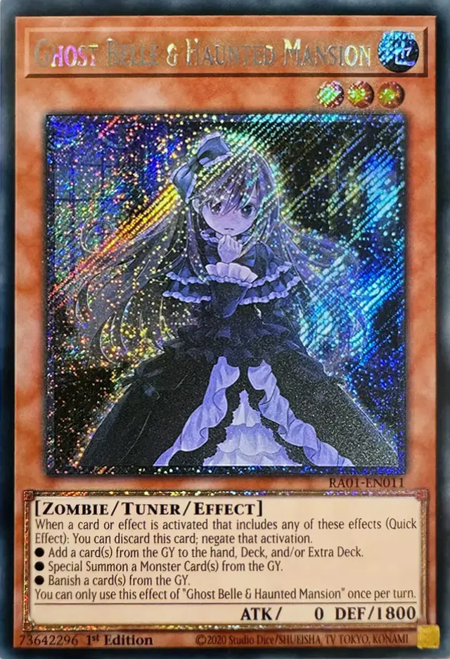
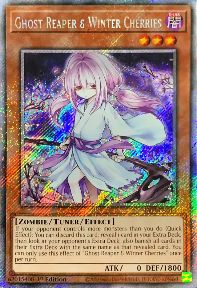
Rarity Collection (RA01, RA02, RA03)

Rarity Collection of Yu-Gi-Oh! is famous for presenting the same pool of cards in seven different rarities.Here are some useful tips to help you recognize the different rarities in this set:

Card Name ► Pay attention to the color and effect of the text, which is often the clearest indicator of rarity.
Light ►
Examine the cards under direct light to highlight the different holographic effects.
Comparison ► Compare your cards with a guide or other cards of the same rarity.

SUPER RARE
SR

► Non-foil card name
► Rainbow foil
(image and attributes)

ULTRA RARE
URR

►Gold card name
►Rainbow foil (image and attributes)

SECRET RARE
SEC

►Holographic card name
►Diagonal dashed foil (image and attributes)

QUARTER CENTURY SECRET RARE
QSEC

►Gold holographic card name
►"25th" watermark in the text
►Cross-hatch bright foil
(also outside the image)

PRISMATIC ULTIMATE RARE
PUL

Foil texture on the background of the image, on the card's edges, on the text box, on the attribute/type of card, and on the monster's level. The main subject of the card is glossy, non-foil, standing out with a 3D effect on the surface of the card.

►Gold name
►Ultimate Rare texture

PRISMATIC COLLECTOR'S RARE
PCR

Rainbow dots cover the entire surface of the card, including the illustration and the card's text box. Like the Collector's Rares, it has a foil border with a texture resembling "fingerprints." The card's name is in rainbow foil.

►Rainbow dotted foil
► Collector's Rare texture

PLATINUM SECRET RARE - RA01
PSEC

Platinum Secret cards differ from RA01 to RA02, RA03

►RA01 - Texture secret argentata su nome, contorno layout e immagine

(*For comparison between versions, see the next paragraph below)
PLATINUM SECRET RARE RA02-RA03
PSEC

Platinum Secret cards differ from RA01 to RA02, RA03

►RA02/RA03 -
Silver secret texture across the entire card

(*For comparison between versions, see the next paragraph below)

In the Rarity Collection expansions RA01 and RA02, the Platinum Secret Rare rarity stands out due to the use of holographic effects, with a significant difference:

►Platinum Secret Rare from RA01: The holographic effect, similar to that of the classic Secret Rare, is limited to the image of the card and the outline of the effect's text box.

►Platinum Secret Rare from RA02 and RA03: The same holographic effect is extended over the entire surface of the card, creating a brighter and more uniform appearance. This change makes the Platinum Secret cards from RA02 and RA03 particularly eye-catching and easy to distinguish from the RA01 versions.

It is important to be cautious not to confuse the Secret Rare with other rarities. Carefully distinguish the type of holographic treatment applied to each rarity and expansion.
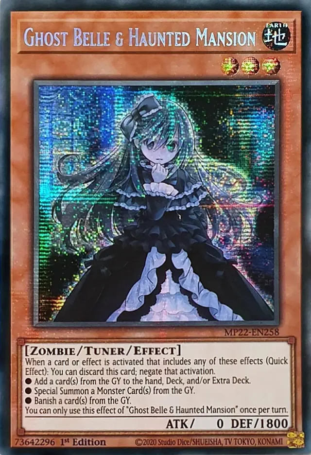
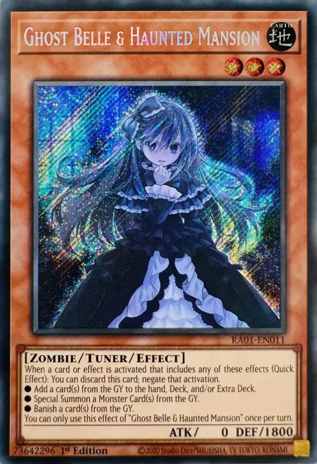
PRISMATIC SEC
MP22

► Holographic card name
► Perpendicular foil
(iimage and attributes)

SECRET RARE
RA01

►Holographic card name
►Diagonal foil (image and attributes)

PLATINUM SEC
RA01

►Holographic silver card name
►Diagonal foil(only image, text box and attributes)

PLATINUM SEC
RA03

►Holographic silver card name
►Diagonal foil (on all card)

Regular, Rainbow, Cold Foil, Marvel

Foil cards in Flesh & Blood are primarily recognized for the glossy effect on the surface, which varies depending on the area of the card that is illuminated. This effect can be more or less noticeable depending on the light and angle from which the card is viewed.
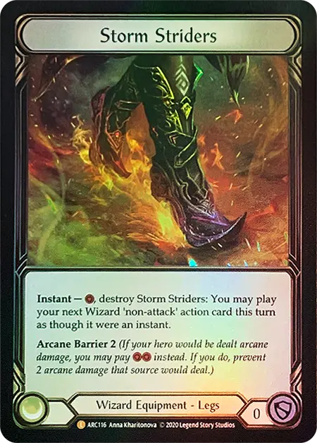
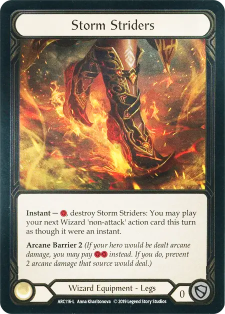
RAINBOW
Rainbow foiling

Glossy finish that creates rainbow reflections across the entire surface of the card. The most common foil found in every expansion.

► Rainbow foil
► Uniform smooth effect

COLD
Silver foiling

A more subtle and refined foil effect (initially exclusive to the First Edition), typically applied to edges and metallic details, with a cooler, metallic look.

► Silver foil
► Rough matte effect

GOLD COLD
Gold foiling

Similar to Cold Foil, but with a golden effect, used for very rare cards and mainly distributed as prizes for high-level competitive events.

► Gold foil
► Exclusive to promo cards

MARVEL
Cold Foil details

Exclusive foil similar to Cold Foil for the Marvel rarity. These cards, featuring extended and alternative artwork, are visually spectacular and highly sought after by collectors.

► Cold foil details highlighted
► Alternative artwork

When examining Regular (non-foil) and Cold Foil cards, it's important to distinguish between them:

Non-foil cards:
► Regular cards have no glossy effect. However, some non-foil versions may have particularly sharp details or slightly different colors, which can be misleading. Always check the card type and the set it belongs to.

Cold Foil:
► Cold Foil cards are characterized by a more subtle gloss, visible only in certain areas like weapons, armor, or metallic details. This effect is more delicate than Rainbow Foil and may appear less noticeable, especially in low-light environments. Be careful not to confuse Cold Foil with non-foil or poorly printed cards: Cold Foil is rarer and is typically associated with equipment or important cards.


Rainbow Foil
cards can also be tricky to distinguish, especially in specific cases:

Less noticeable foil effect: Some Rainbow Foil cards, especially those with dominant colors like red, may have a less bright foil effect. This happens because dark or intense tones, such as red, tend to reduce reflectivity, making the card appear non-foil at first glance.

Lighting: Insufficient lighting or the wrong angle can make the Rainbow Foil effect almost invisible. To check, tilt the card under strong and uniform light to reveal the glossy effect. In these cases, it’s easy to confuse a Rainbow Foil card with a non-foil one, so always examine the card under good lighting to avoid mistakes!

First Edition (Alpha) e Unlimited


In Flesh & Blood, there are two main editions for each set: 1st Edition and Unlimited. The distinction between these two editions is crucial, especially for collectors and those looking to understand the value and rarity of the cards.
1st Edition cards are generally rarer and more valuable, while Unlimited cards are intended for a wider audience, still maintaining high quality and appeal for players.

Here’s how to distinguish the First Edition and Unlimited editions for the different Flesh & Blood sets:
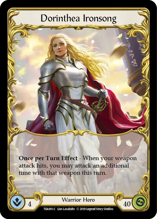
EDIZIONI UNLIMITED
SIGLA ESPANSIONE (ABC)
Unique Edition (Unlimited): Starting from the Uprising set, there is no First Edition. All cards have an expansion code next to the serial number to identify the set. The colored circle is still used to indicate rarity, but without the distinction between editions.
WELCOME TO RATHE / ARCANE RISING

FIRST EDITION
No rarity dot
UNLIMITED
Solid color dot ⬤
CRUCIBLE OF WAR, MONARCH, TALES OF ARIA, EVERFEST

FIRST EDITION
Solid color dot ⬤
UNLIMITED
Empty color dot ◯

One Piece

Guide available soon

Digimon

Guide available soon

Lorcana

Guide available soon